Ranch Textures
Some ranch and adobe elements… for reference, for interest, for aesthetics, for storytelling… and the things that caught my eye.


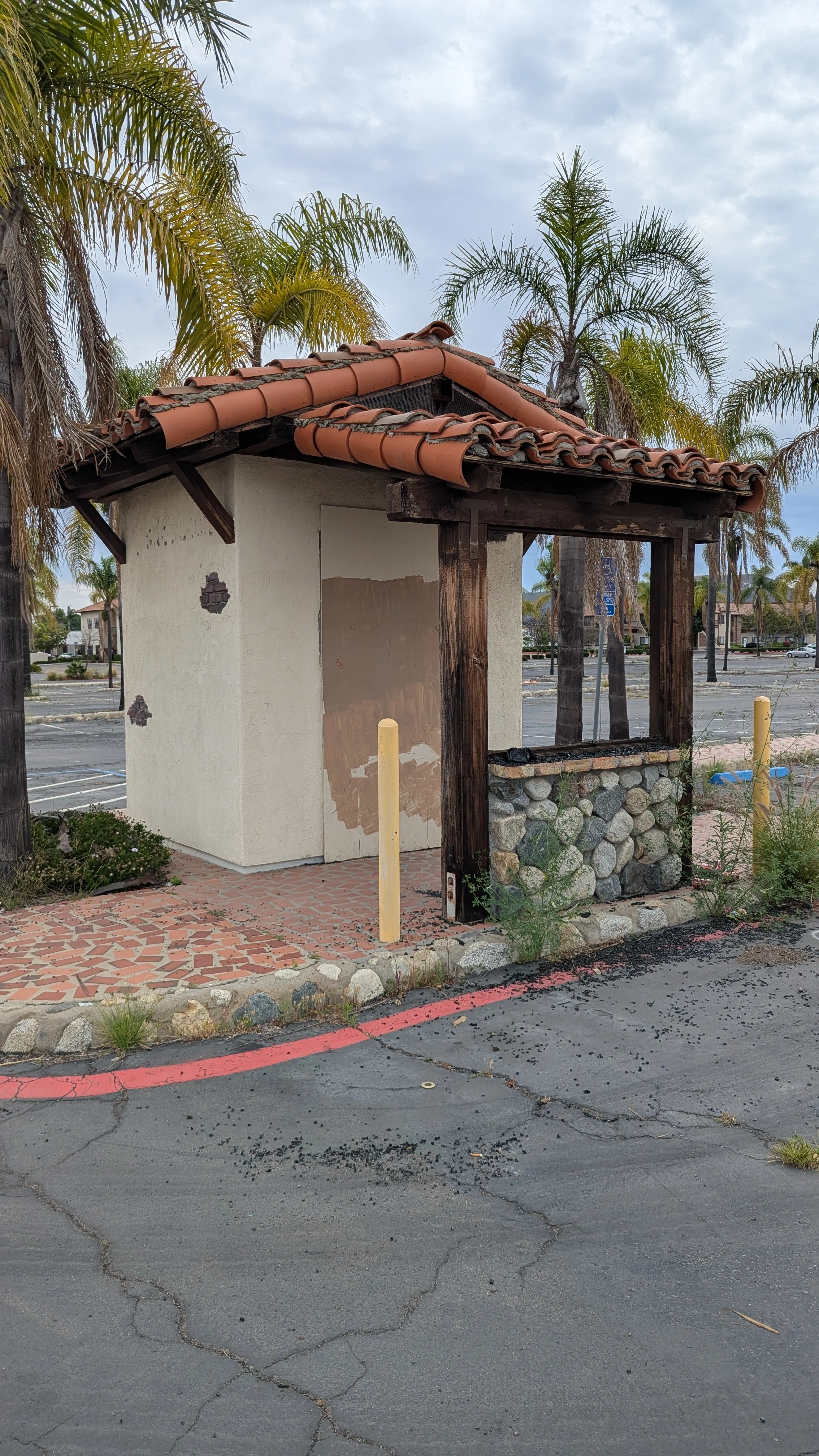
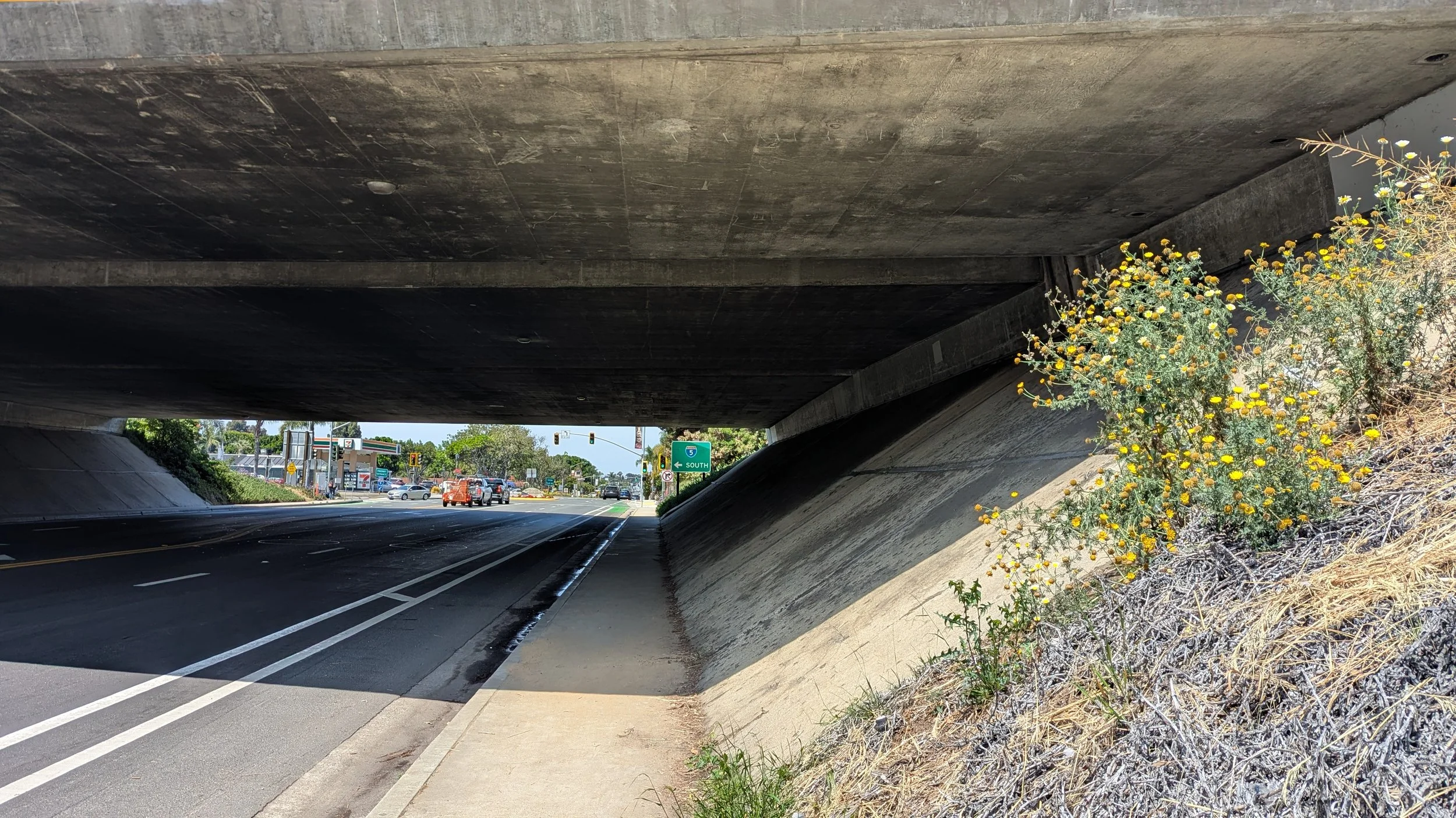
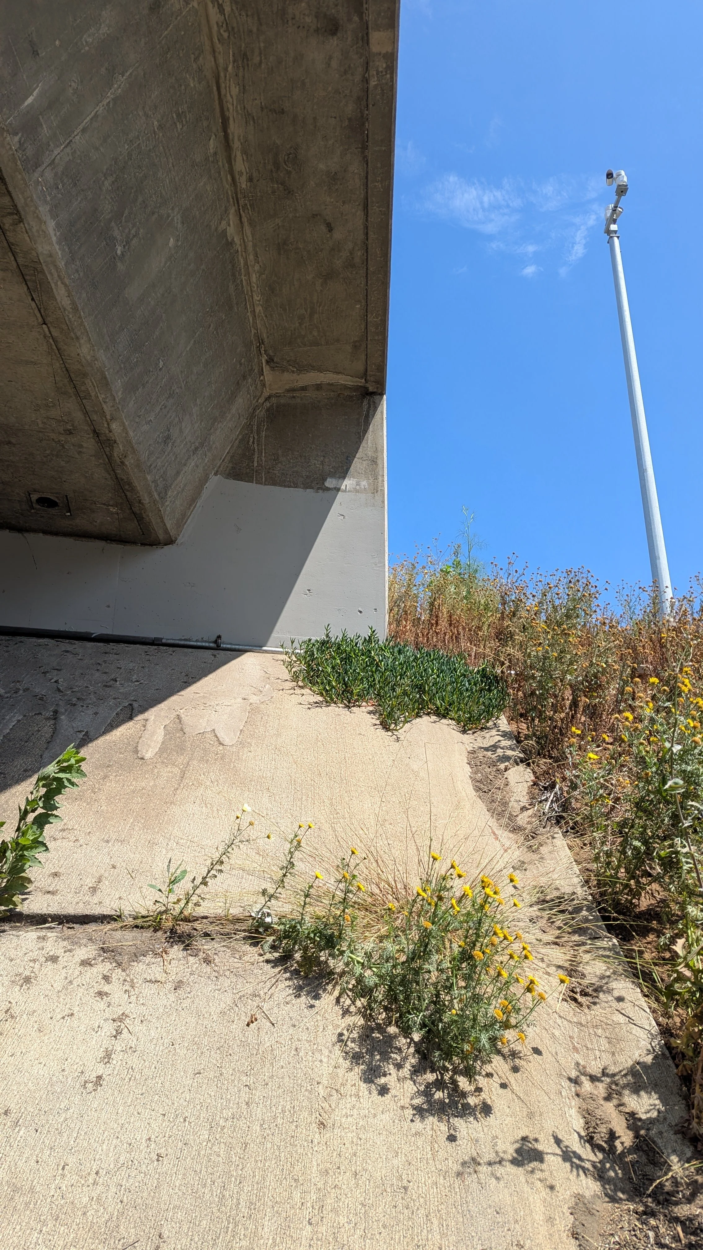
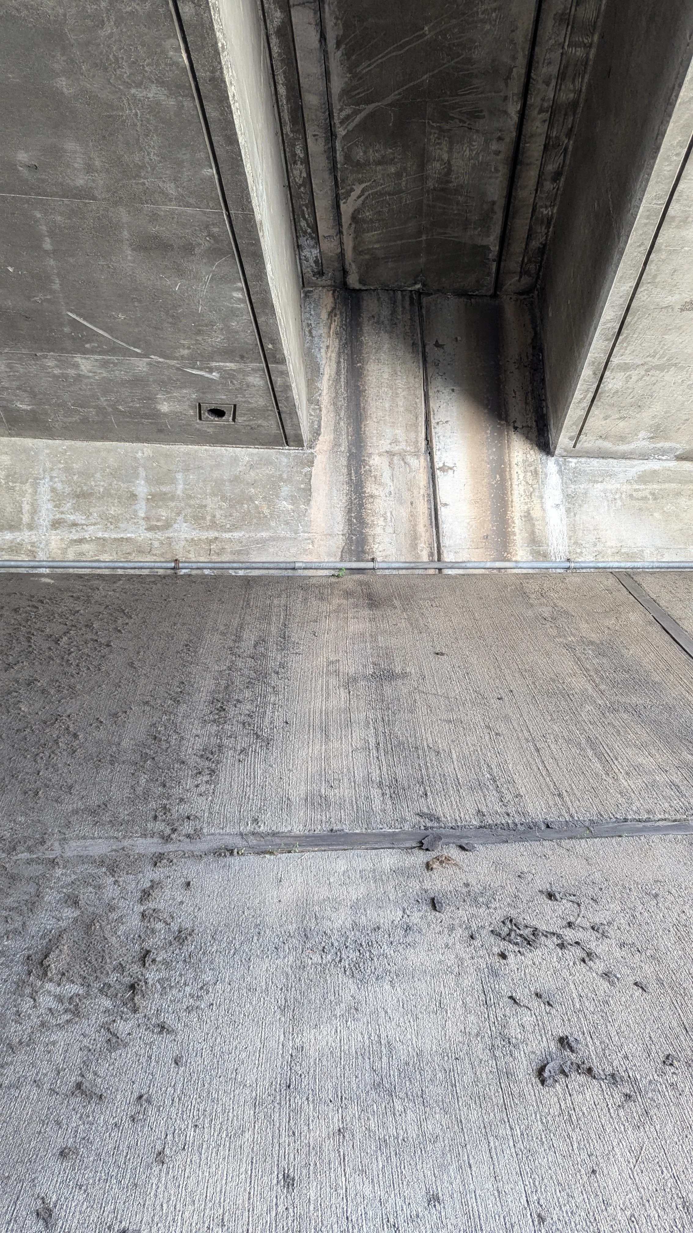
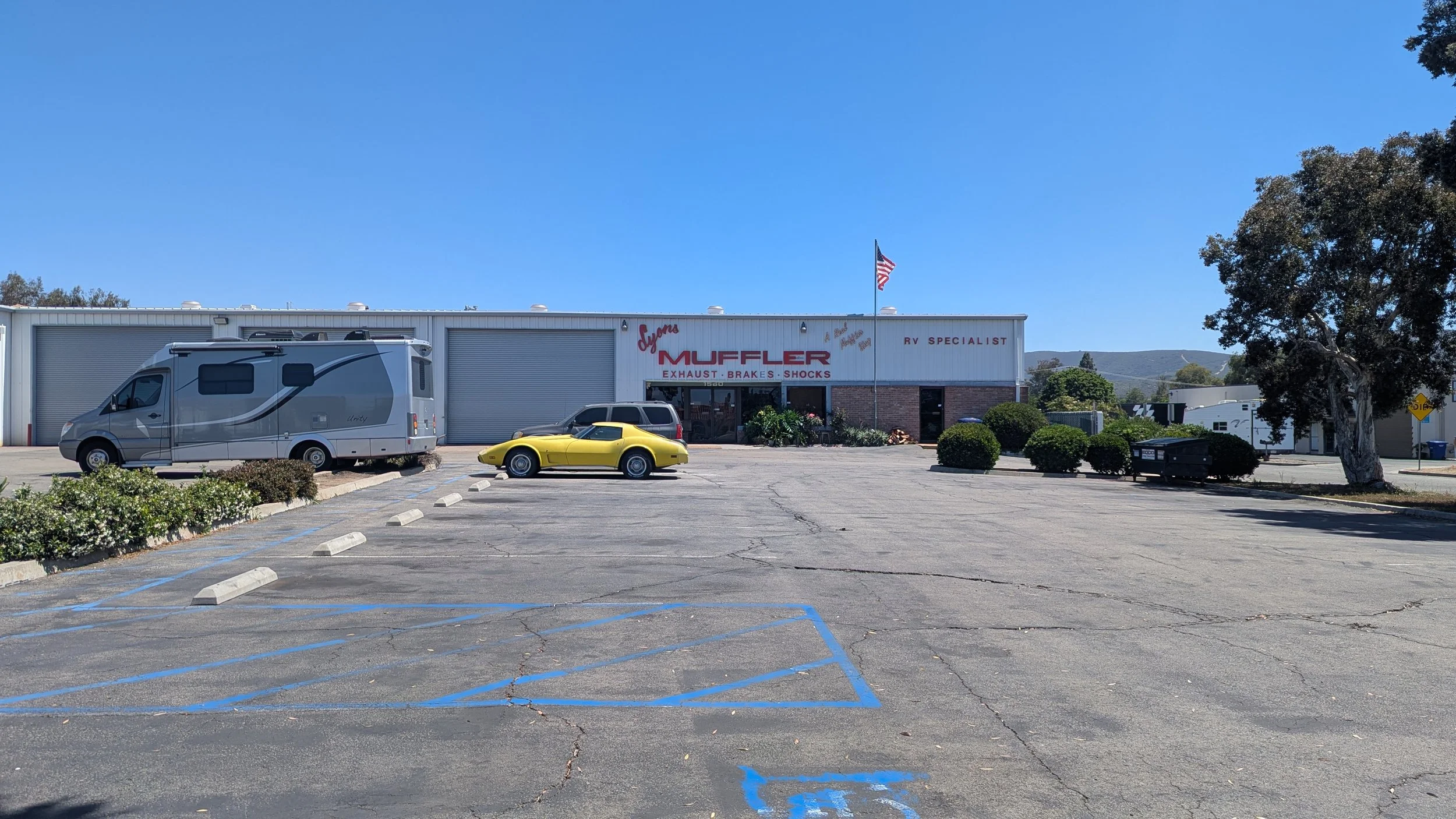
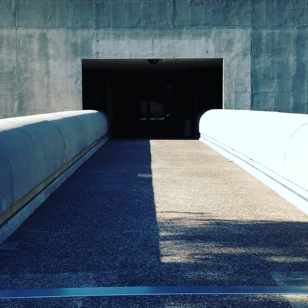
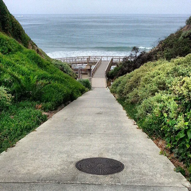
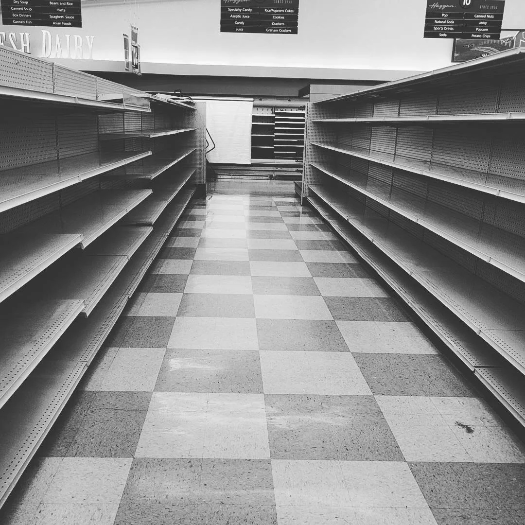
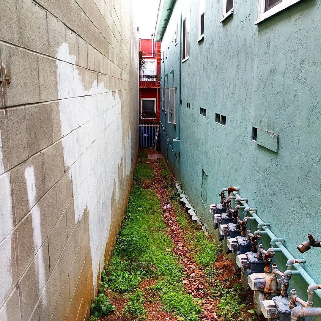
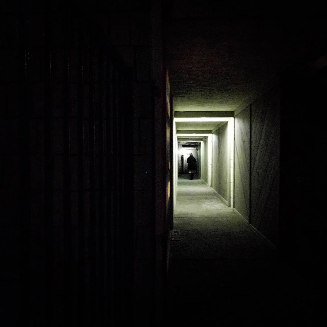
The next few images are from beyond the ranch. These are reference images that I have been considering… stuff I collect before I believe I’ll ever need it, because I like it and I think I’ll like it in the future. The last image is of Steve Ignorant, one of the singers in the band Crass circa late 1970s, 80s. Leading with the destruction at Restaurant Row around February 2025. The underpass at Carlsbad Village and Interstate 5 is providing some of those trapezoidal keyholes that I’ve been fond of for a long time. The mass of freeway concrete is captured in a few shadow studies. And a fetching storefront in San Marcos, CA.


The Ramp
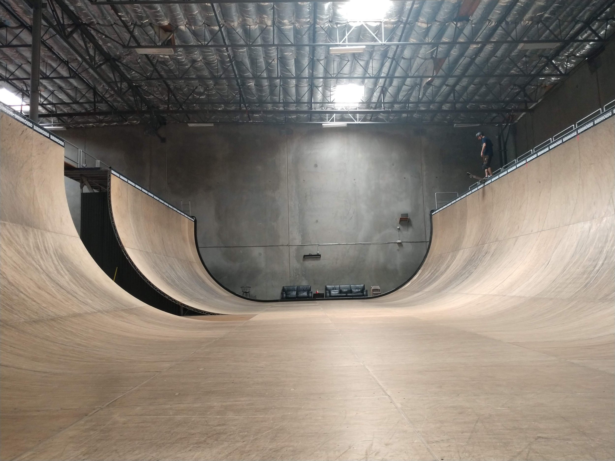
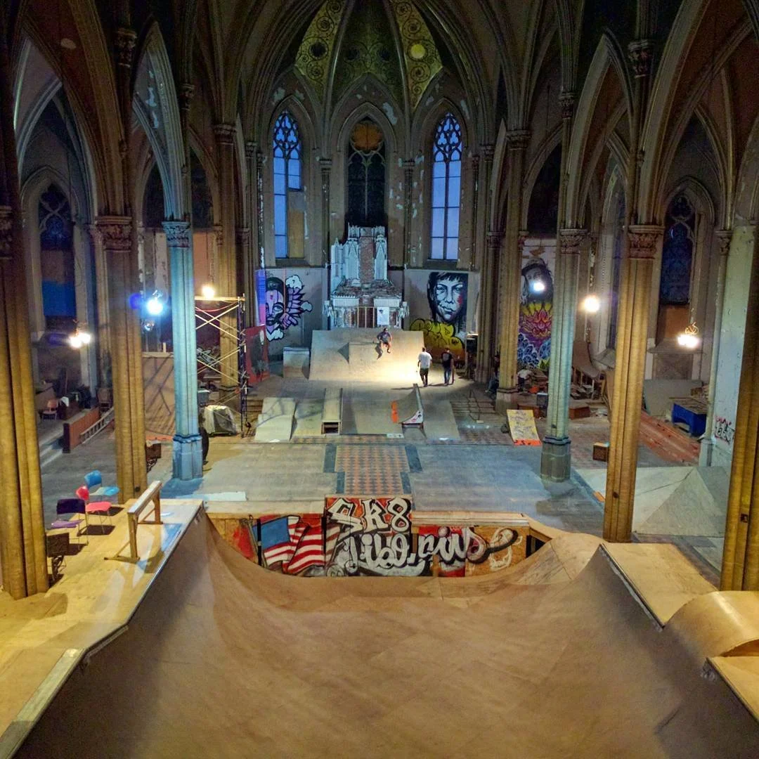
For about 20 years I worked to get public skateparks produced in the United States. For about 10 years of that time my office was in the building that housed Tony Hawk’s vert ramp.

The warehouse is a concrete tilt-up deal with one end carved out for offices. Around the ramp is some factory shelving for inventory, a small “street” course, and event gear.
What is its form? It’s a flat-bottomed U-shape. The decks are 13-and-a-half feet above the bottom and the radius of arc is about 15-feet. The last 12 or 14 inches at the top of the ramp are straight up and down. That’s where the “vert” (for vertical) part of “vert ramp” comes from.

For the most part things around the ramp just carried on like normal.
While I enjoyed skating the ramp, it didn’t call to me the way some other kinds of skateboarding terrain did. Vert ramps have always been kind of exclusive; rare and private. Vert skating, as a subcategory of skateboarding overall, was characterized by aerial tricks. The slams could be catastrophic and I know lots of people that were seriously injured skating this type of terrain.

Any time something with wheels is left on the ramp it triggers the imagination.
Sometimes the ramp would generate a big session. People would mill around the edges, phones out, capturing the runs. From my desk I could hear the occasional bails, the boards flying. On most days, however, the activity was relatively subdued; just one or two skaters sharing the ramp.
The ramp is an elegant shape and color. The warehouse is warm.
For the most part the ramp was quiet. Often it was just Tony staying loose. He was often working on new tricks. It was an inventive laboratory in that way. Sometimes a whole new element was introduced to the ramp that afforded new kinds of interactions.
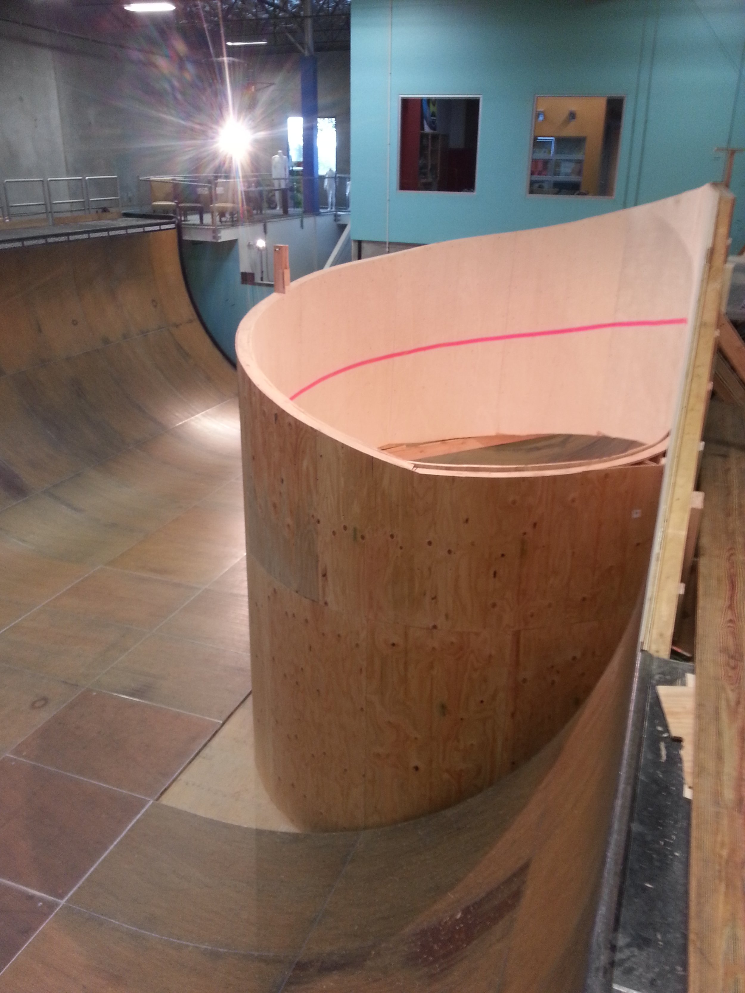
The ramp was often reconfigured to meet some design goal. This “corkscrew” structure was difficult to engineer and took lots of trial and error with the crash bags before the real effort.

I think the ramp has a lot of character and so there are lots of fun visual conversations possible.
As my time working in skateboarding matured I began to feel conflicted about the complicated interactions between skateboarding youth and the companies that supported and profited from their dedication. That cynicism became a factor in my diminishing job satisfaction.
This space hosted a small sound stage for video production before it became Tony’s office. The window overlooks the warehouse where the vert ramp is located. You can see the decks and railings through the window.

The ramp was an ideal design for skateboarders as well as BMX riders. The black marks are where BMX tires landed on the ramp’s face.
I’m grateful for the opportunity to do good for skateboarding young people and the people who love them. Being supported to pursue skatepark advocacy on a national level was an amazing and exquisite experience.

Book: Smithsonian Annual Report
My local college library has a free-book cart that they roll out from time to time. I’m always on the lookout for treasures. Treasures, to me, are samples of older graphic styles and esoteric imagery.
The other day the shelf had a few of these Smithsonian Annual Report to the Regents. I adopted two of the 4 or 5 volumes to pore over in my own time. I thought some of you, my friends, might enjoy seeing what one of these gorgeous books contain.
The Report we’re looking at here is from the year ending 1900. 125 years ago is before anyone today was alive; this is a book of ghosts.
The book is arranged by reports from various Smithsonian editors and programs. The front matter is largely clerical and shares how much material — documents, artifacts, “evidence” — has been procured by the institution.

The two volumes are thick and heavy.

The title page has a lot of useful things on it. The distressed edges of the paper are subtle and irregular. The set type — a narrower version of a face I know as Modern No. 20 — has its quirkiness at the challenging kerning situations like the W-A in Washington and the B-O-A in Board.
The gem is the emblem that reads “For the increase and diffusion of knowledge among men per order (of the) Smithsonian Institution, Washington 1846.” The design elements are superb; torches with ribbons, a dotted line, and arced type, with a map of North America at the center of everything.
Even the rubber-stamp that the library has used has its own kind of charm… an uneven application of ink, off-center, off alignment, off the page.

A full-page map of the Zoological Park expansion. Note the nice compass rose and the hierarchy of type on the title.


An early section showcases the animals that are detained in the Smithsonian Zoological Park. Here are a few of their proudest animals.

A graphic example featuring a map of Smithsonian’s “science camp.” Most of the science is devoted to astronomy.


A few photographs showing Smithsonian’s astronomy camp.


There is a beautiful section of the book featuring solar phenomenon. There is an accordion-fold insert featuring the arc of the moon in front of the sun that is one of my favorite images in the book. Seems like a Bauhaus record cover to me.


The book has lots of graphs and charts that mostly are readable… some are too technical for me to comprehend.


There is a section that examines the astronomy tools in Peking, China. The illustrations are exquisite engravings. I’ve included some details to better reveal the technique.


The chapter that recounts a prototypical flying machine. Note the chart comparing a human and bird skeleton where both skeletons have (for some reason) a hoop through their skulls. What gives?
There is a signature on the night watercolor-looking illustrations but I couldn’t find anything easily about the artist.


A gorgeous section on a blimp — since were in the section about the sky — that is launched from a lake. Note the small fold-out poster showing the blimp at the apex of its flight.


A short section on meteorological kites. I suppose that’s how it was once done. Check out the massive kite reels that are attached to the wheelbarrow-like carts. That’s a great idea.


There are terrific graphics and illustrations throughout the book. Here are a few that I really like.


In 1900 photography was an exciting new way to capture evidence. In one section of the book the authors used photographs and illustration to visualize how sound waves behave.


A short section on the Smithsonian headquarters includes maps and floorplans that seem straight out of a Dungeons & Dragons adventure.


The section on exploration, something Smithsonian was particularly known for, starts with a report on the exploration of the “dark continent.” The fold-out map of Central Africa is terrific. I’ve included details.


The arctic explorations are wild. I love the image of a big, black mechanical beast forcing its way through the ice.


Looking now to history, the book features renderings of prehistoric creatures. I love all of the friendly faces.


Wildlife photography was a new thing in the late 1800s. The camera could capture animals in new, candid ways. This section contains an image of a bird perched on a twig with the whole background knocked out. It’s really pretty… and the pages that are dominated by a large, black vertical image are handsome, too.


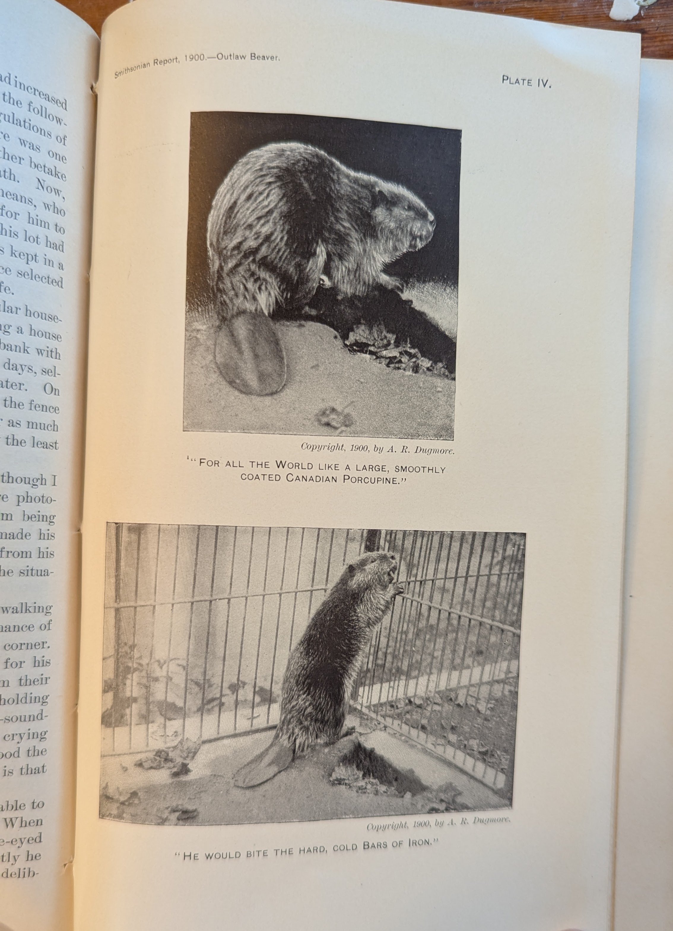

Beavers and Gophers!


The chapter on Egyptian ruins includes a subsection on antique scales. There’s so much great reference here. The large six-sided column covered with cuneiform is amazing.


The last chapter talks about “the new spectrum.” I think it’s a wave range that was recently discovered. I love the massive fold-out poster!

The glossary shows the breadth of topics that are offered in this sturdy annual volume.
If you would like to explore archival volumes of Smithsonian Reports, they are generous with large, comprehensive (seeming) scans on their website. I encourage you to go there for more juicy Smithsonian stuff.
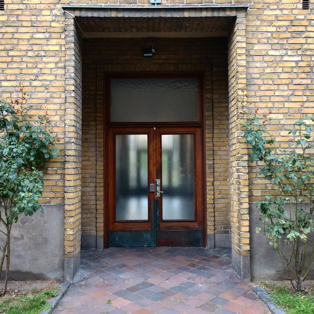
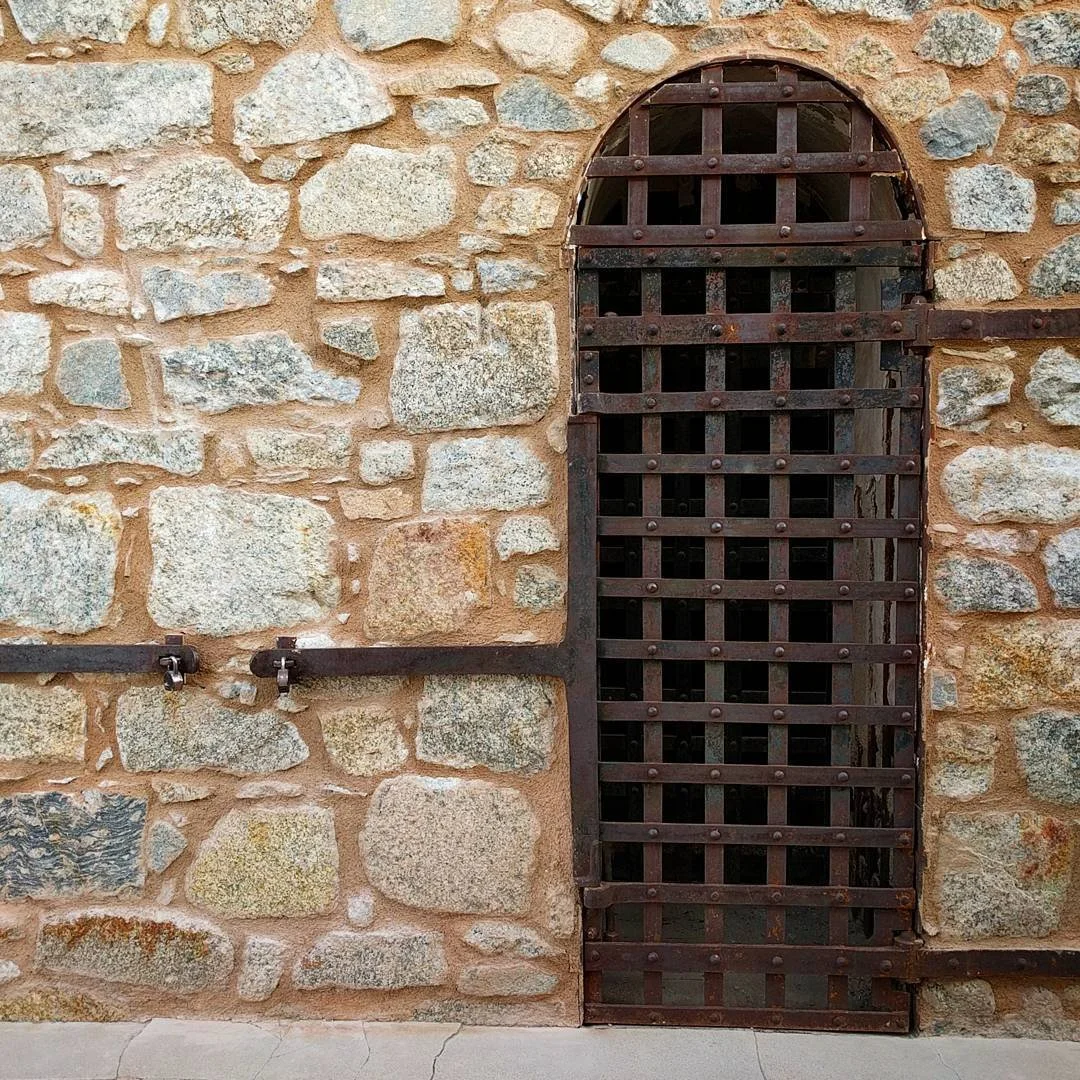
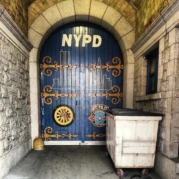
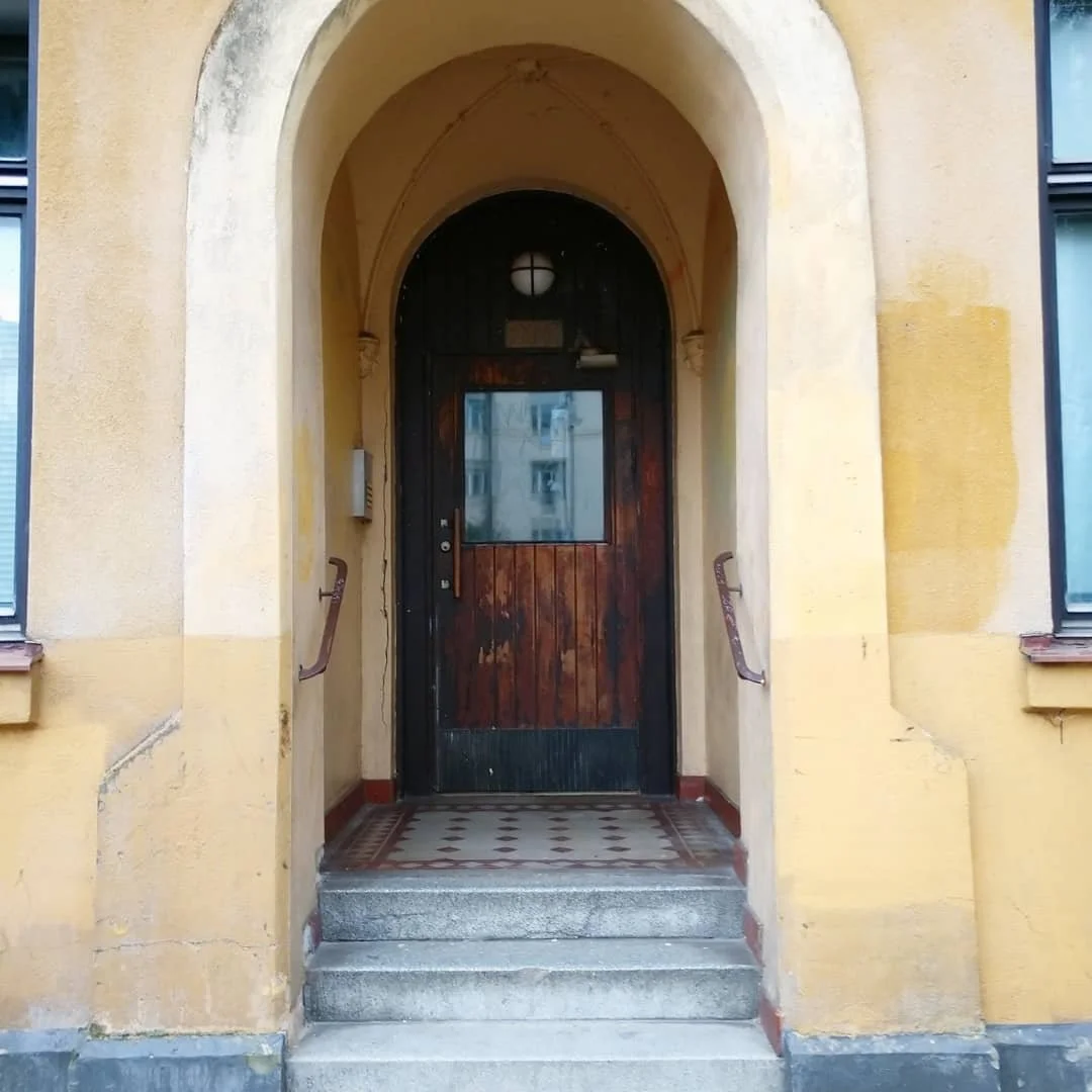
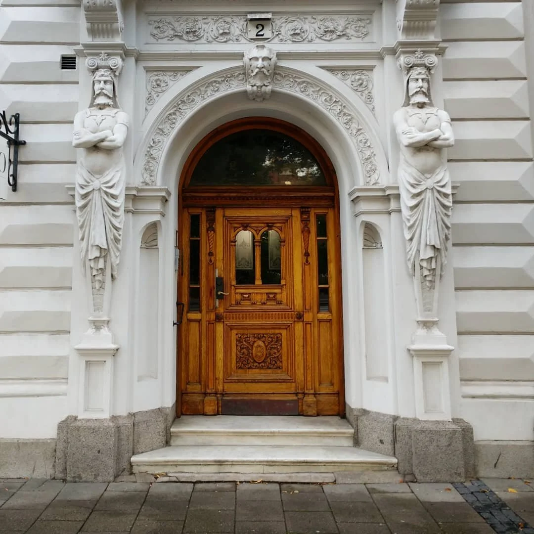
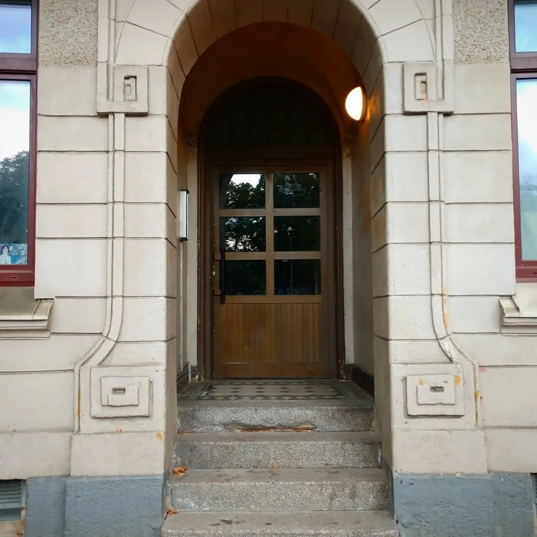
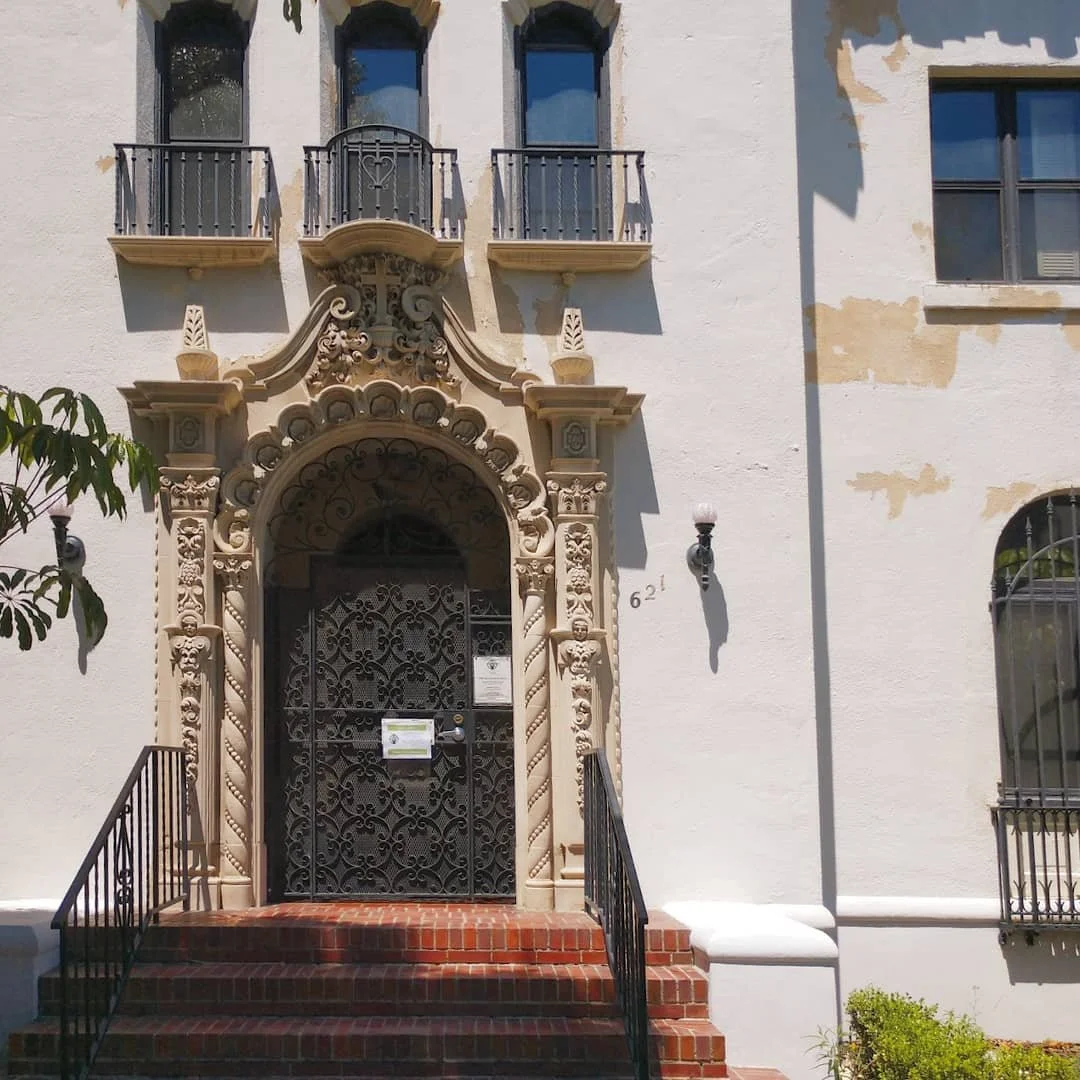
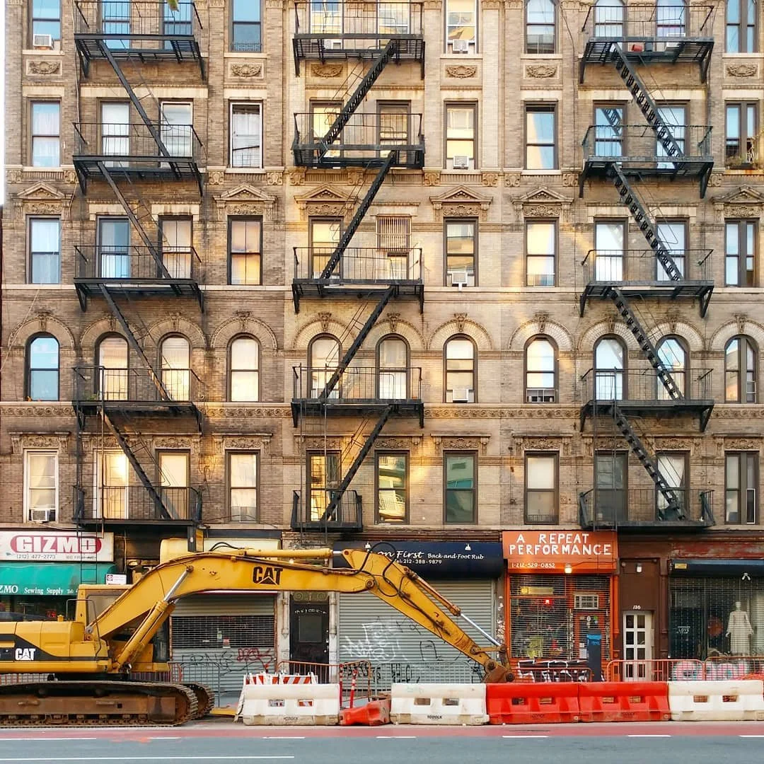
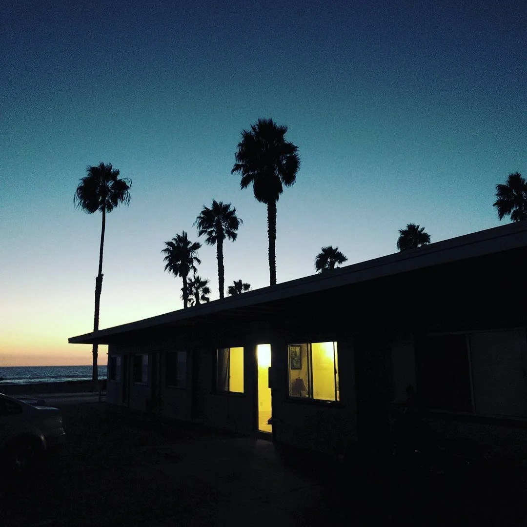
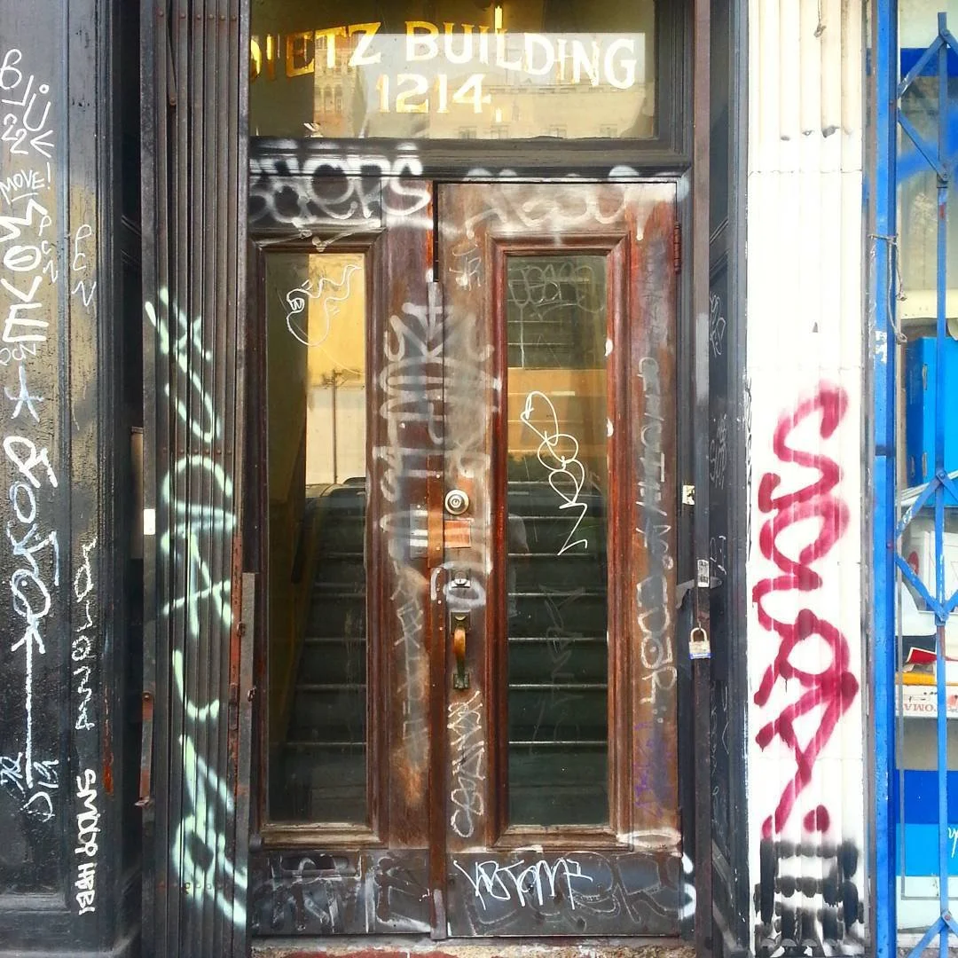
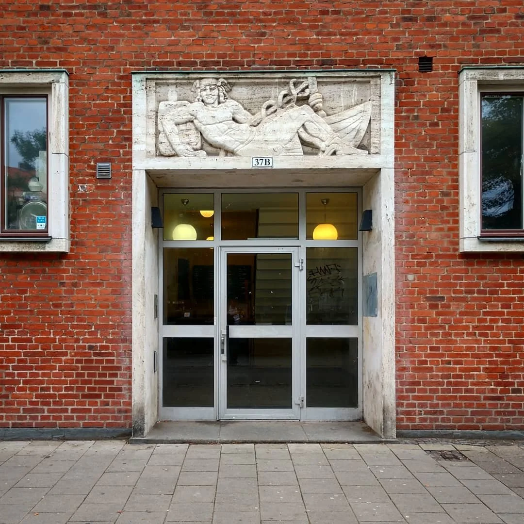
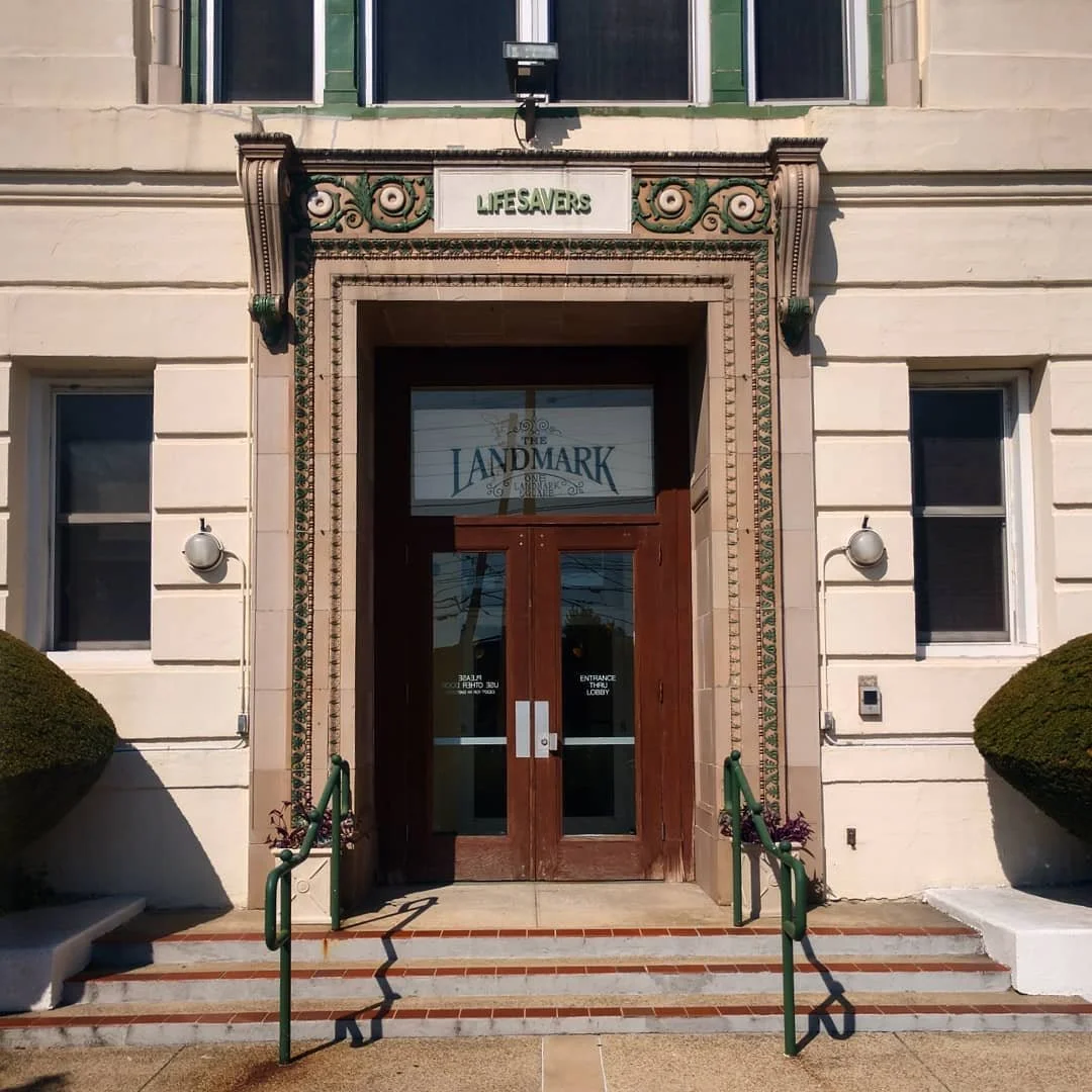
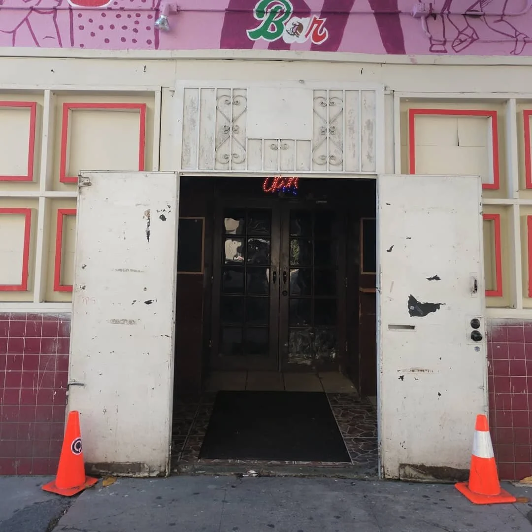
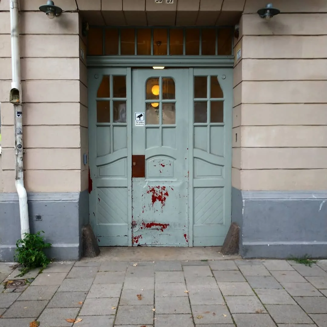
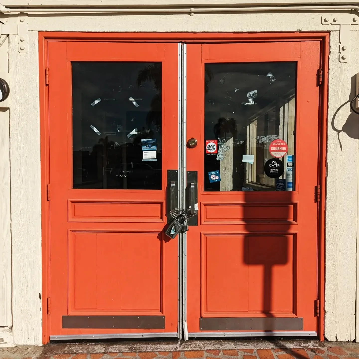
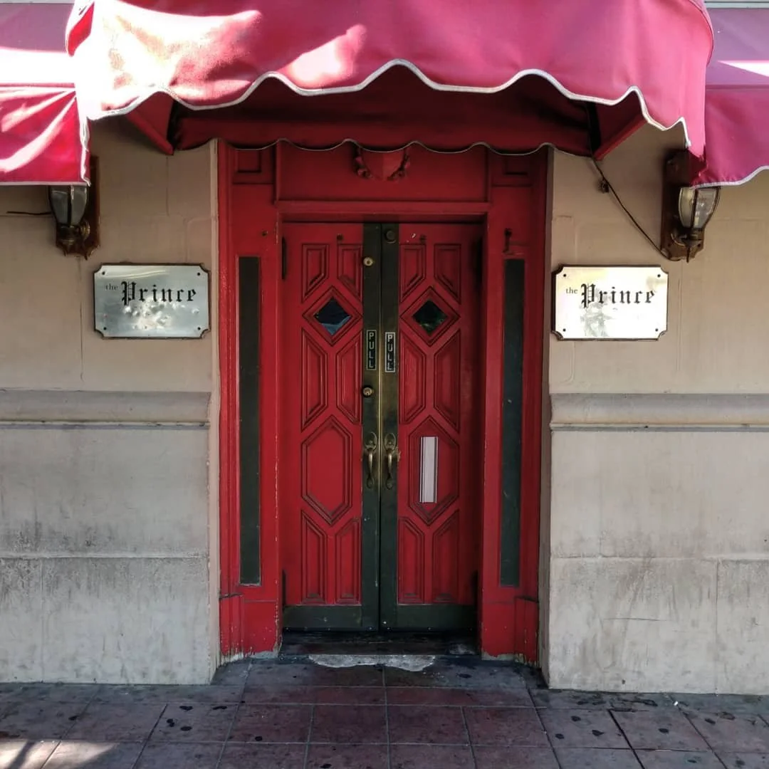
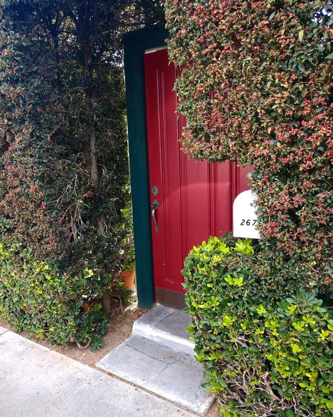
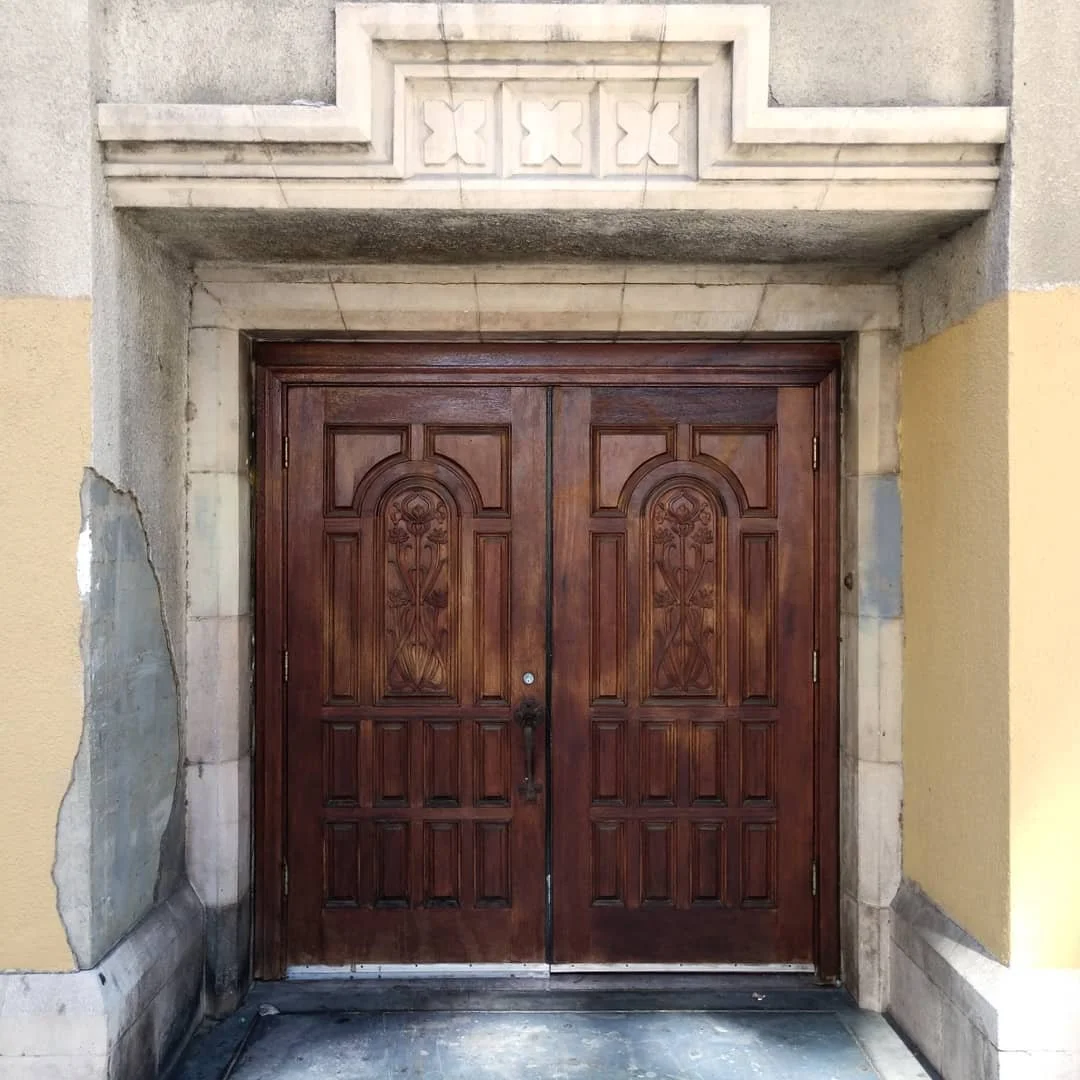
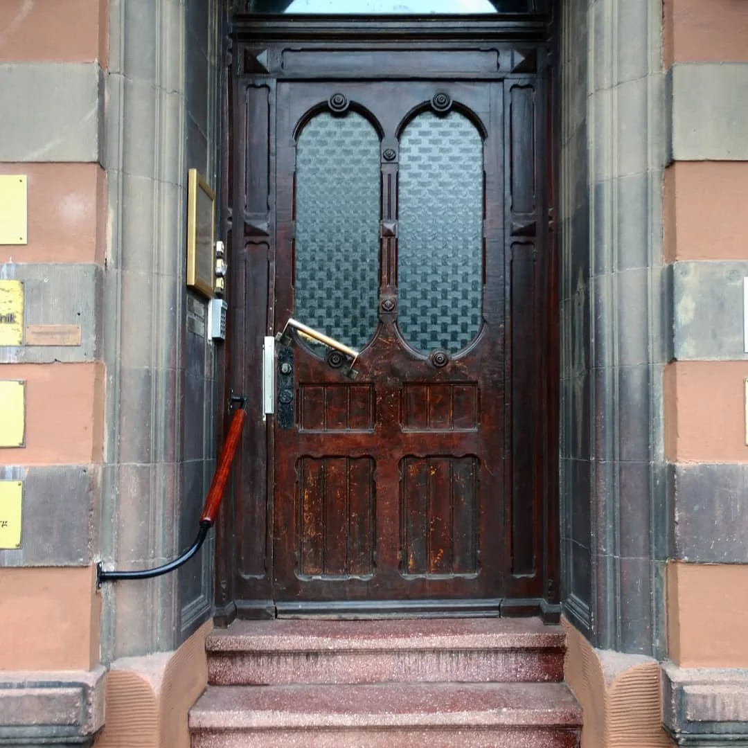
Doors
An image set of doors
Doors express a kind of exclusivity. Every door’s purpose is to allow egress for some and not for others. They are like physical shibboleths that designate access (or denial of access) based on specific circumstances. The fact that they are often ornamental and expressive is part of their purpose.


Mystery Stairs
An image set of stairs
I love stairs in images because they convey a sense of human scale and purpose. Stairs represent a kind of promise… they lead to an unseen destination. They can produce a sense of wonder and inspire curiosity.


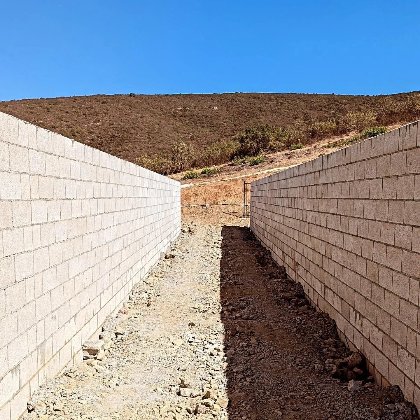
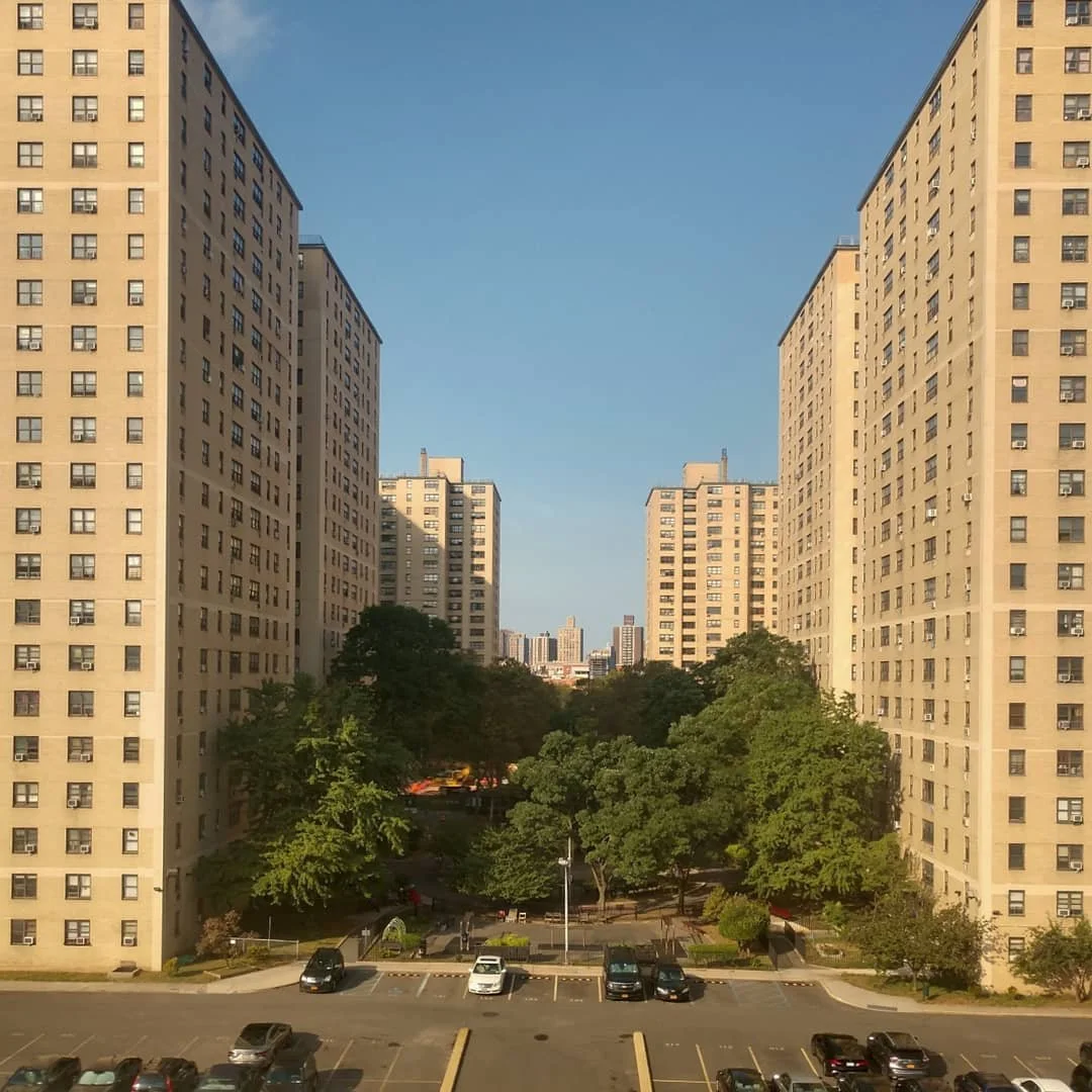
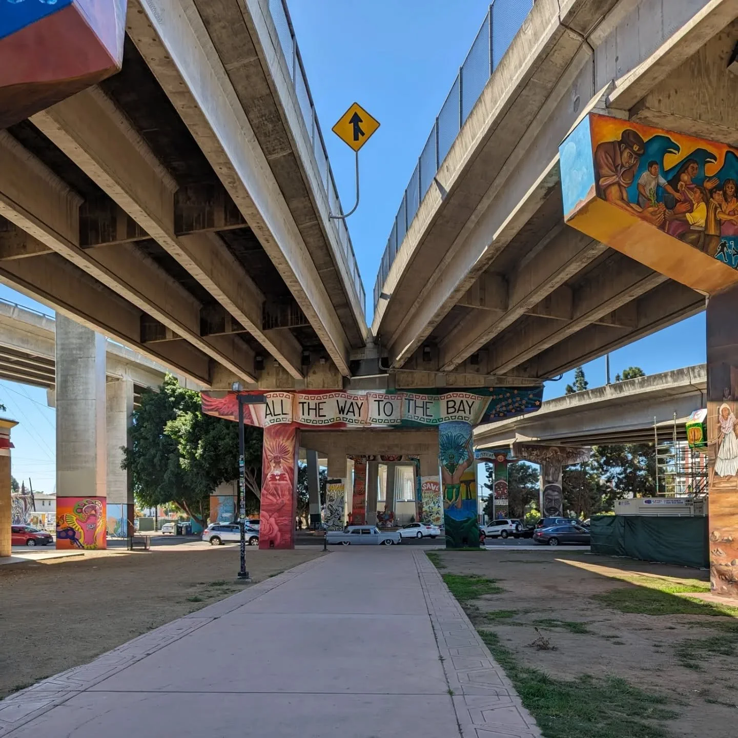
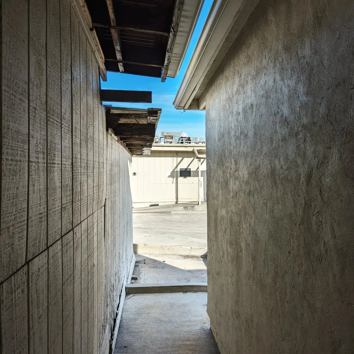
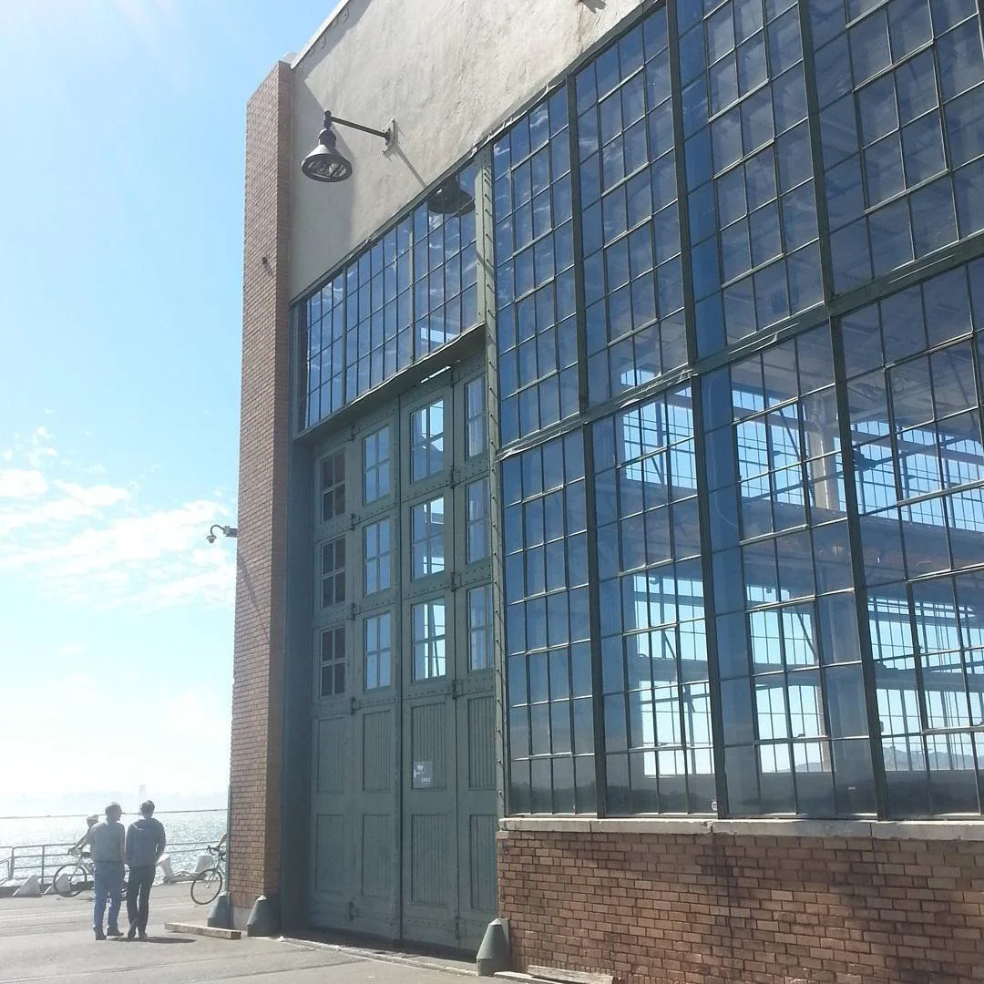
2-Point Perspective
An image set exploring 2-point perspective
Two-point perspective is line an argument between two vanishing points. The contest is dynamic and creates tension. Sometimes the two points are distant, as these images suggest…


…and sometimes they seem to be in some kind of internal conflict, like the following images.


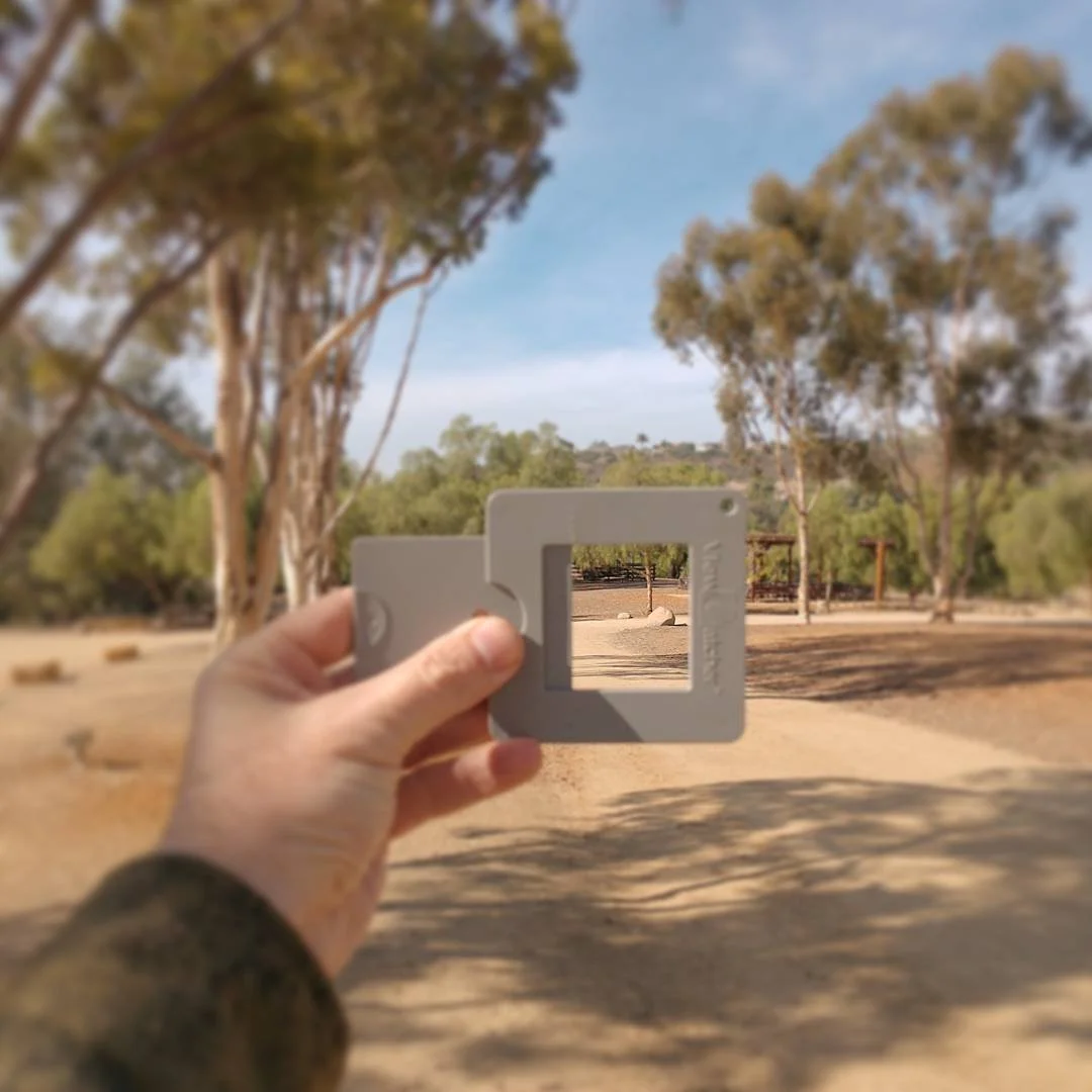
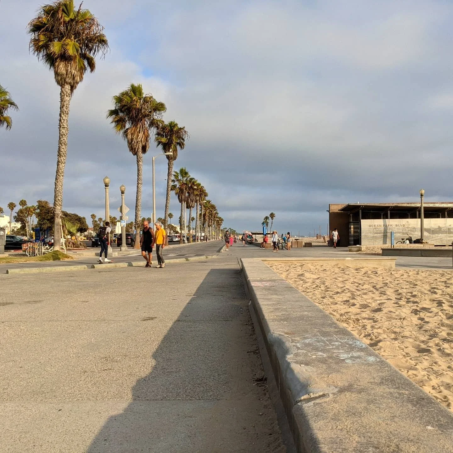
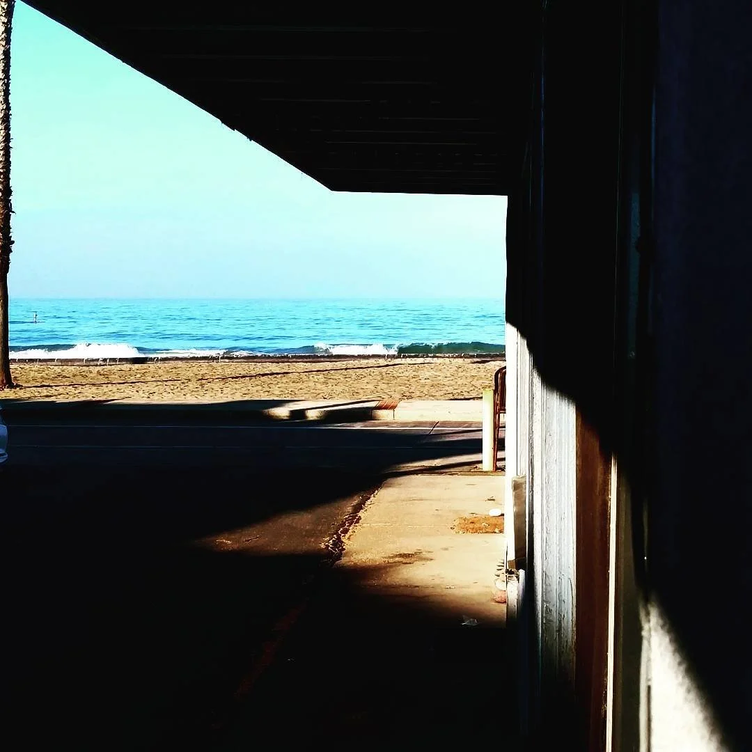
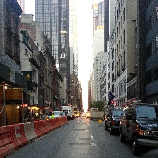
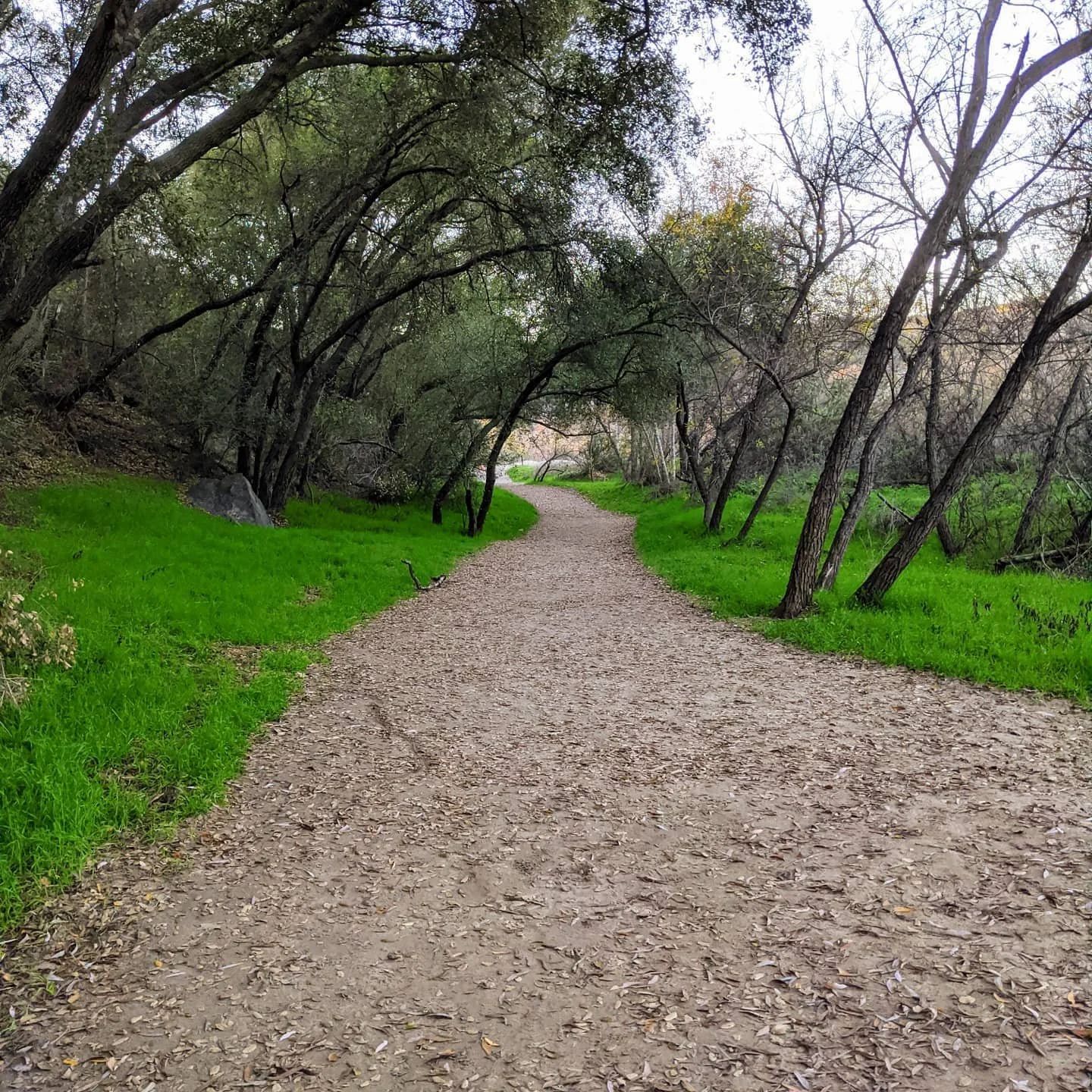
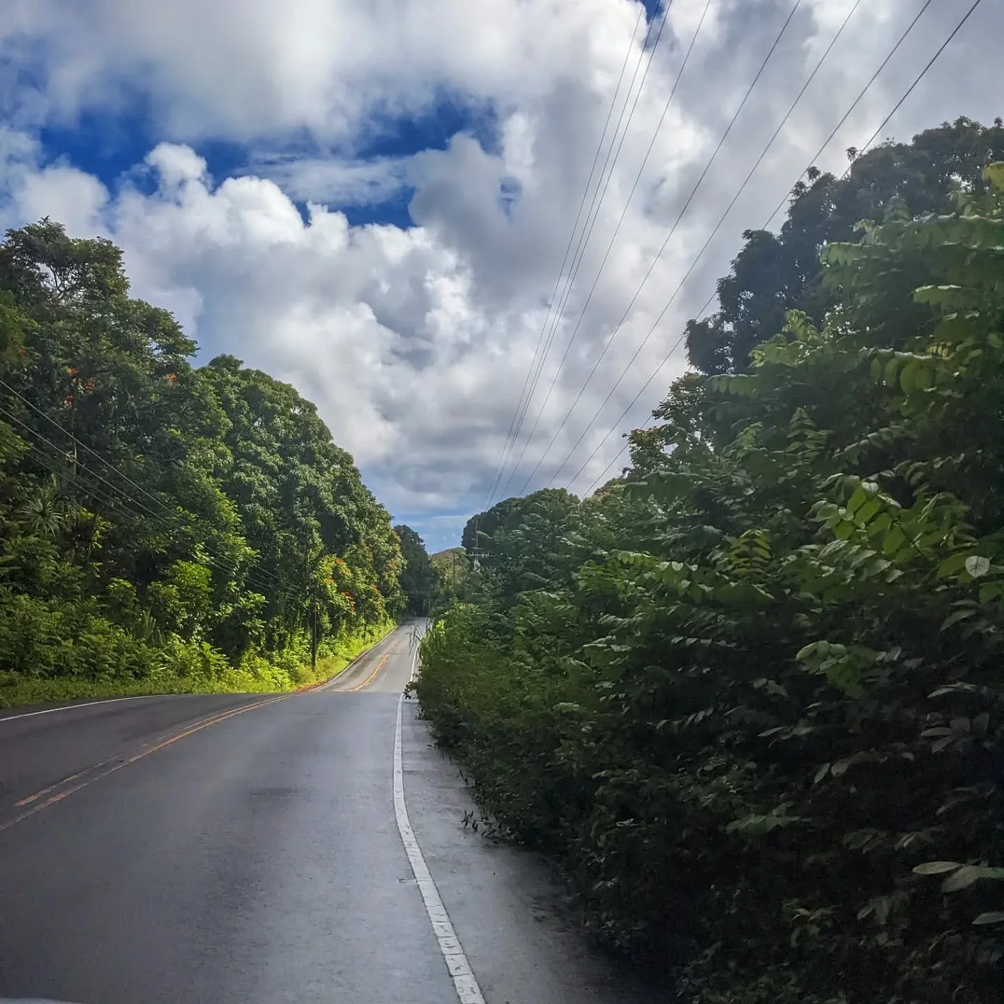
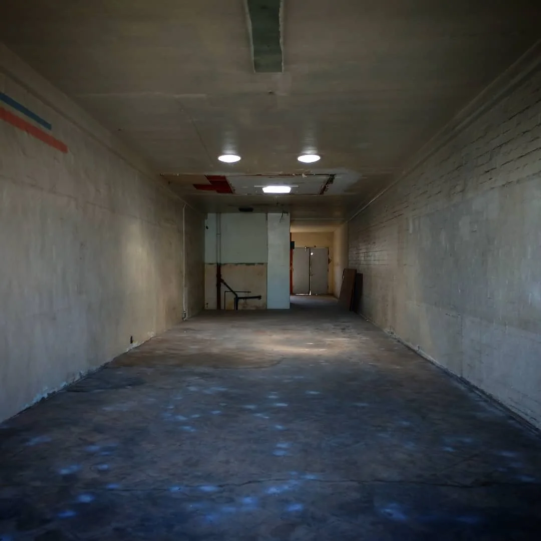
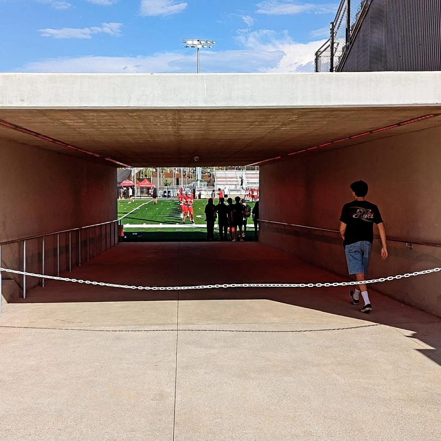
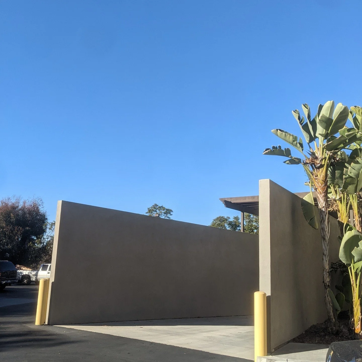
Perspective
An image set exploring 1-point perspective
One-Point Perspective: As things recede into the distance they appear smaller. I don’t know why this is but I know it’s important for interpreting depth and understanding where things sit in space.
Here are some images that express this phenomenon. I find these images to be especially interesting from a compositional standpoint; irresistible and captivating. It’s almost as if our eyes are magnetically drawn to the point where things converge. What a valuable compositional tool!


Two-Point Perspective: Two-point perspective is like an argument between two vanishing points.


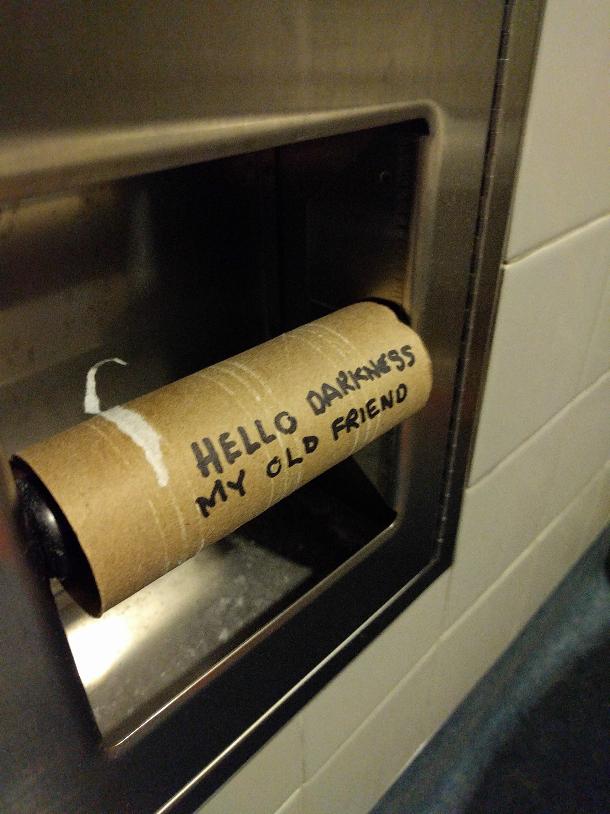
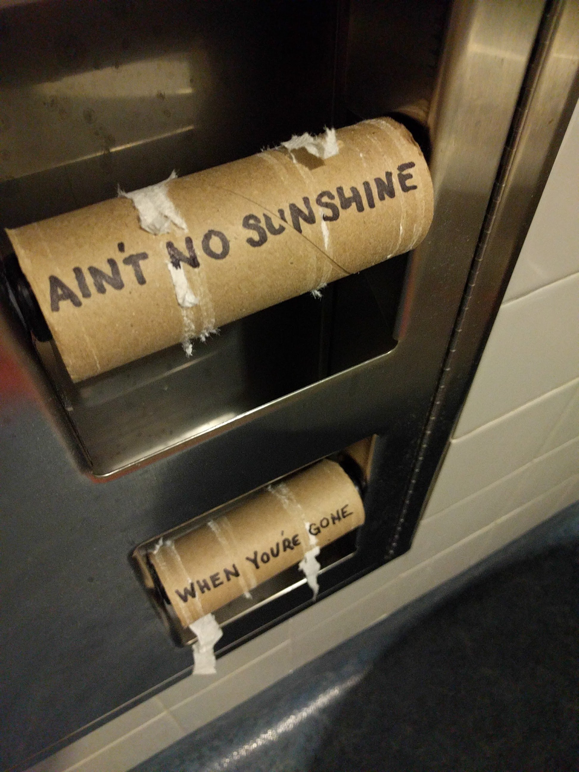
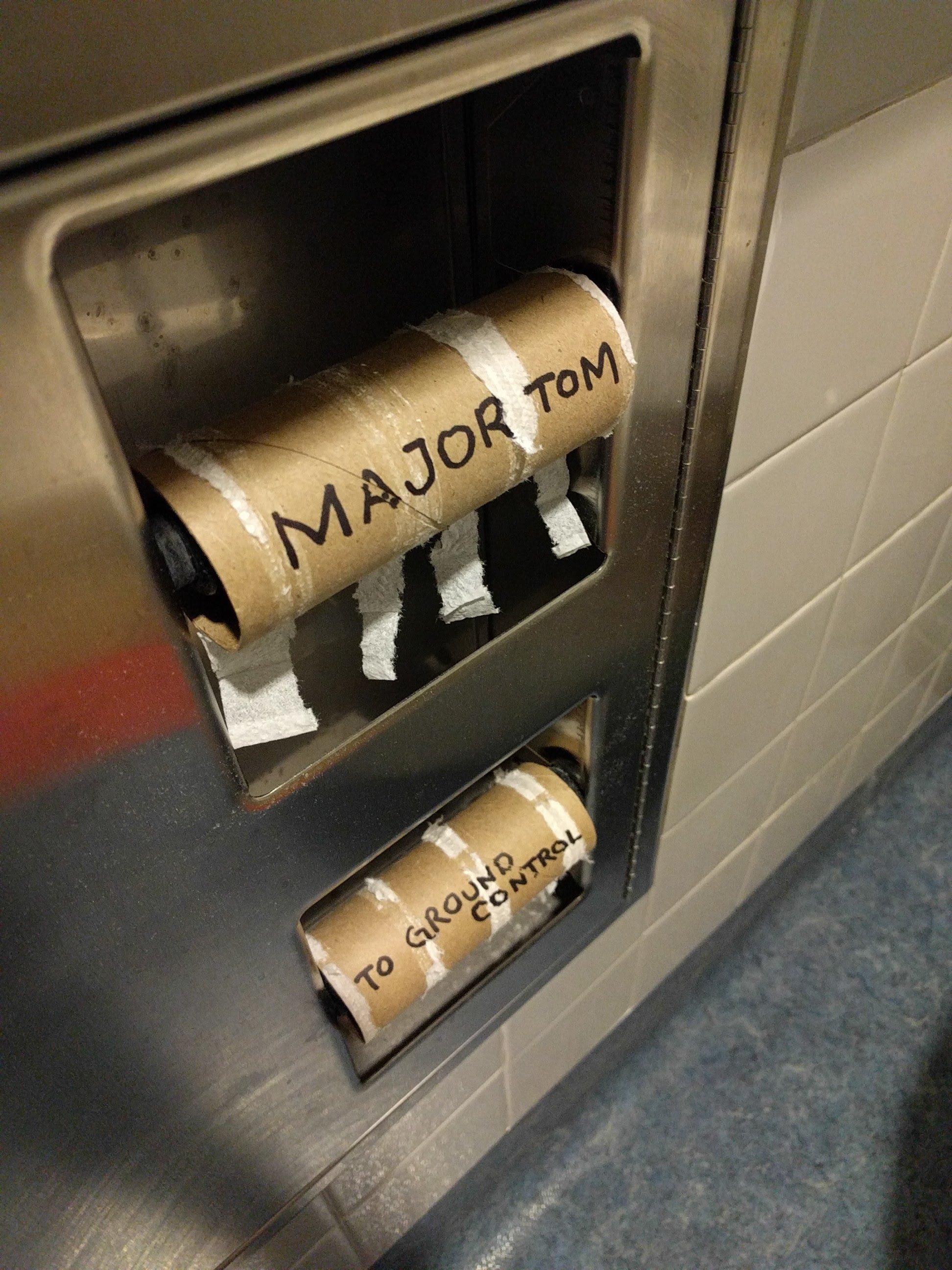
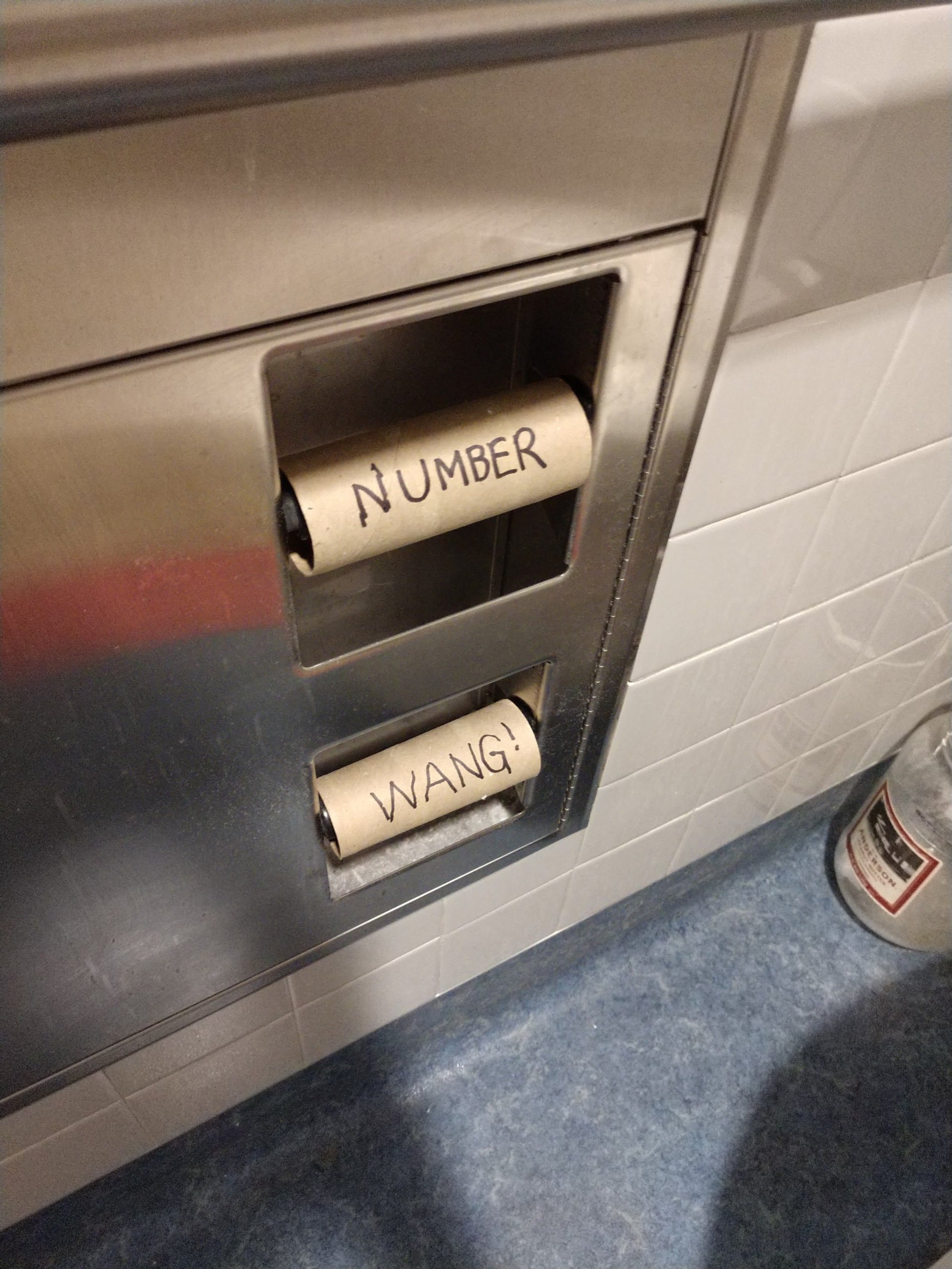
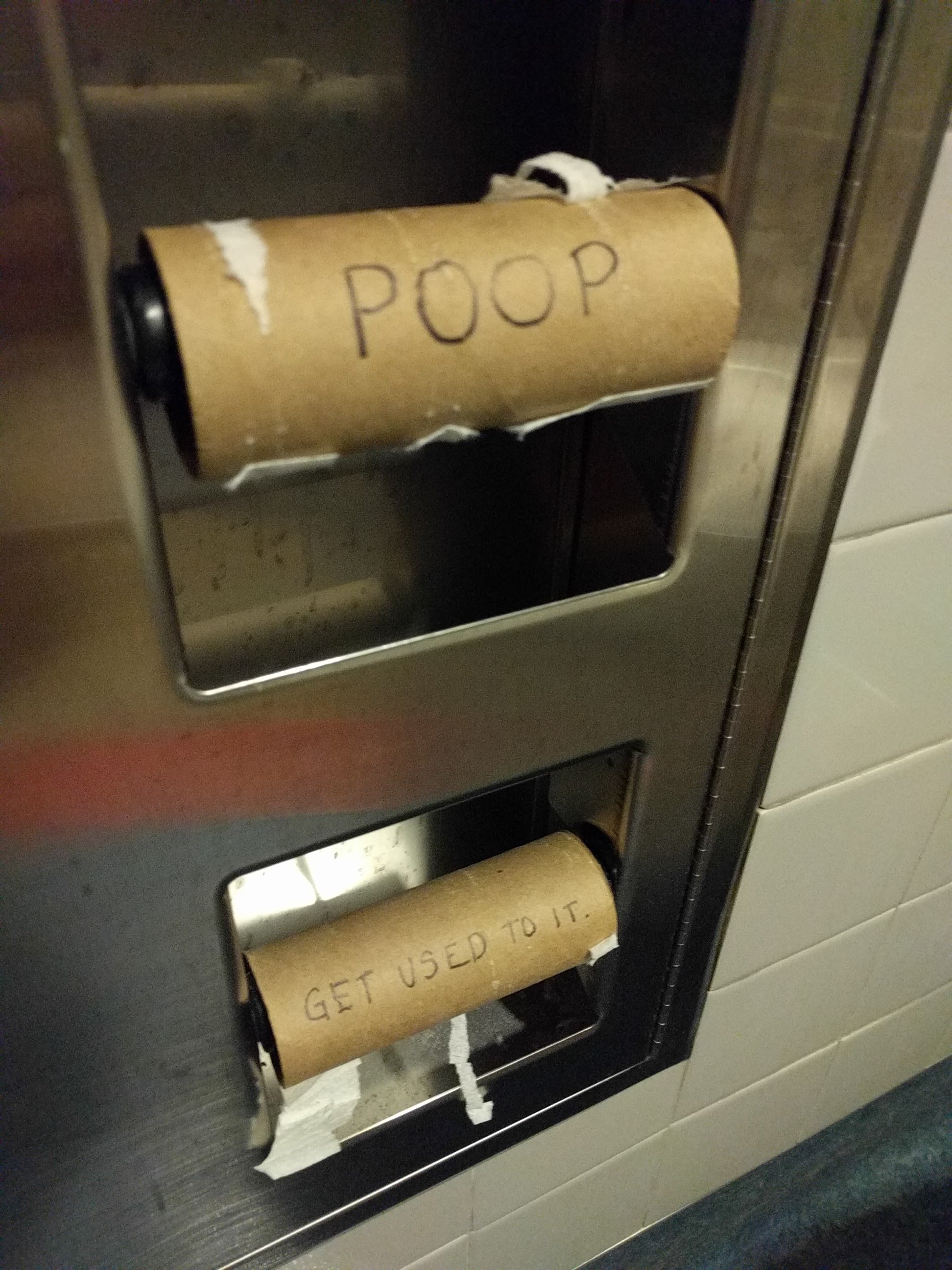
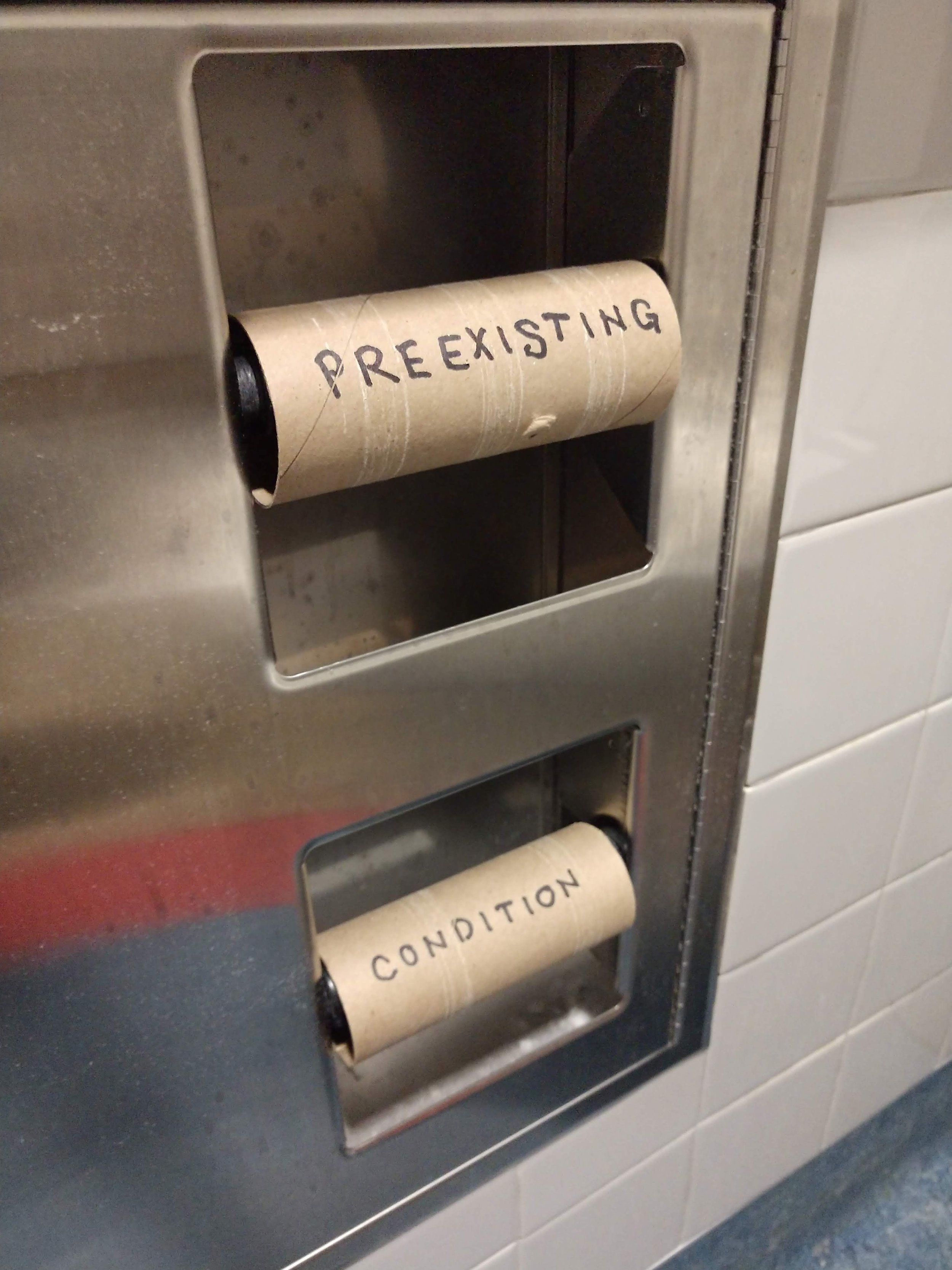
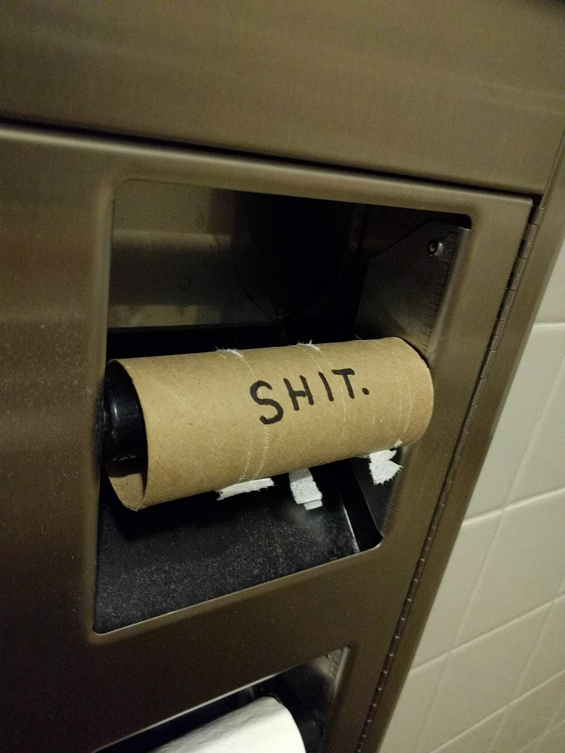
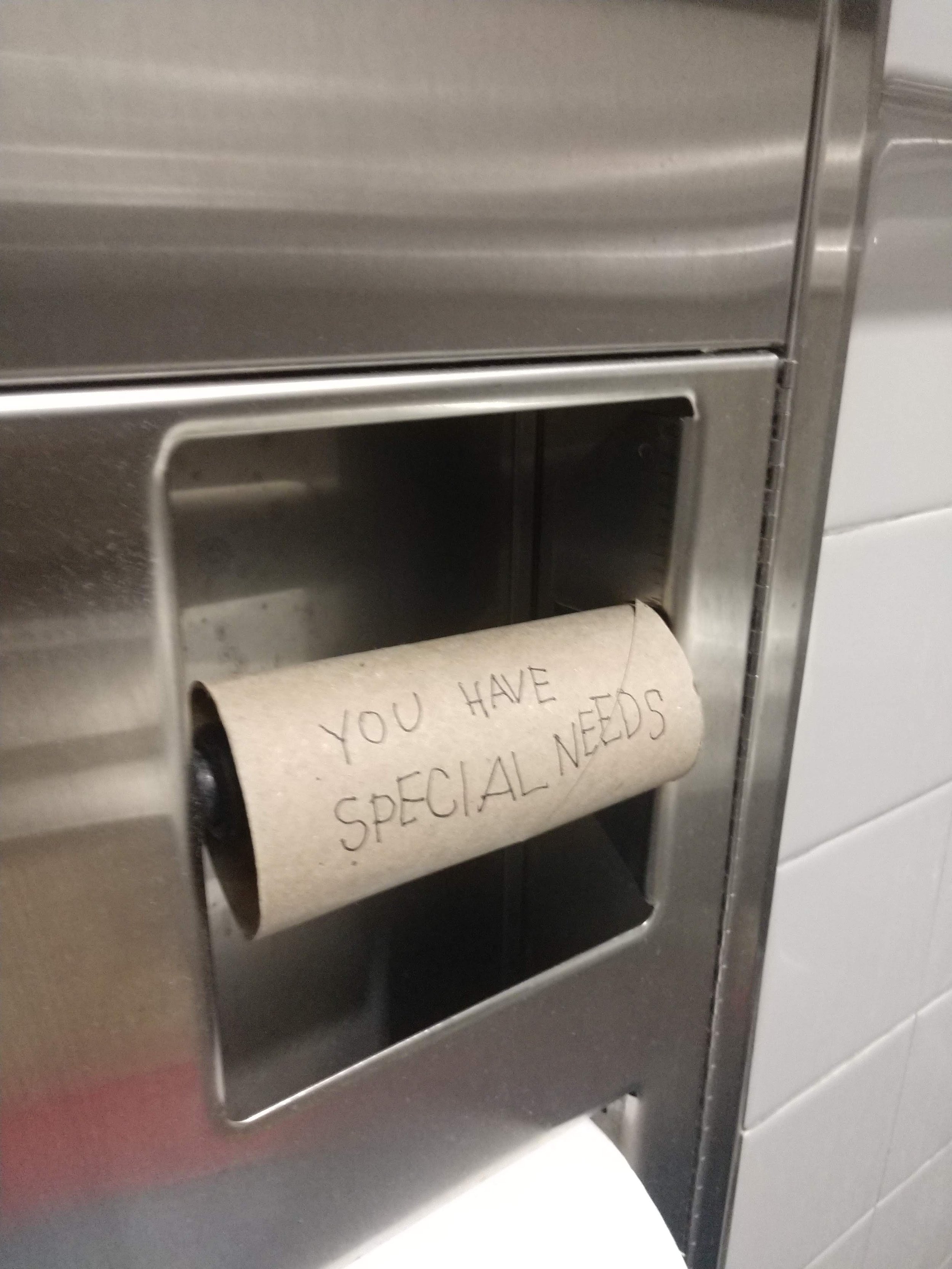
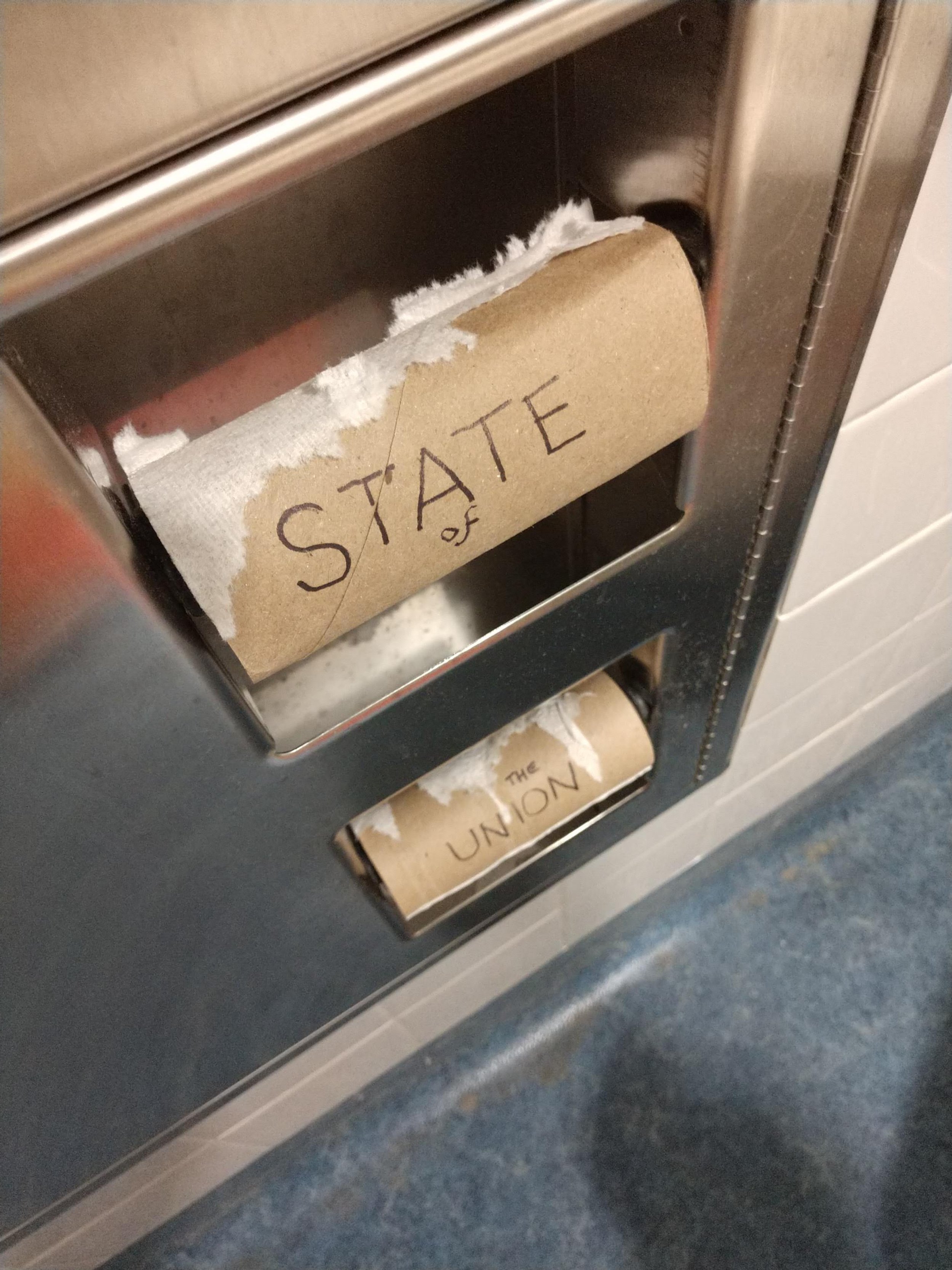
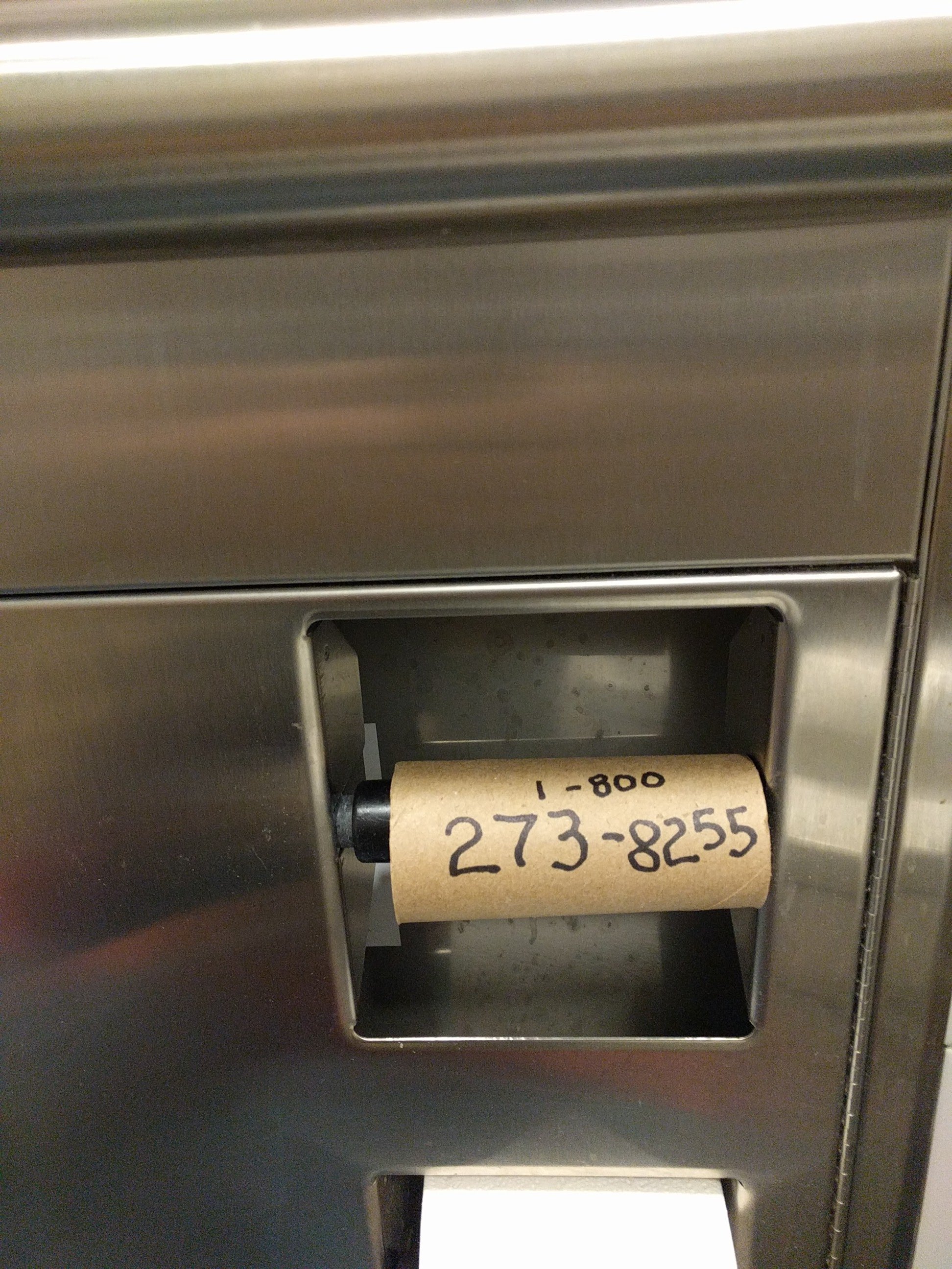
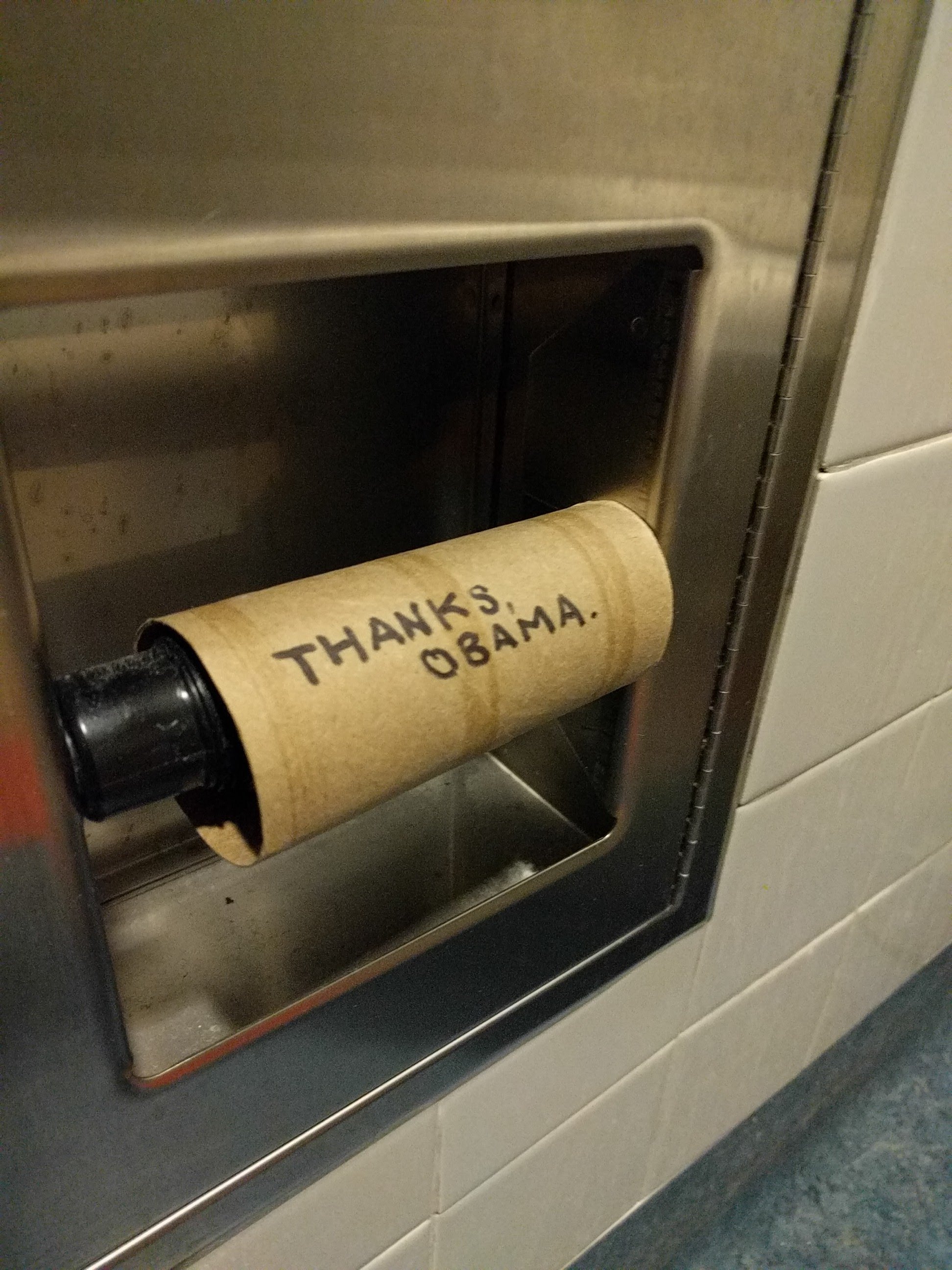
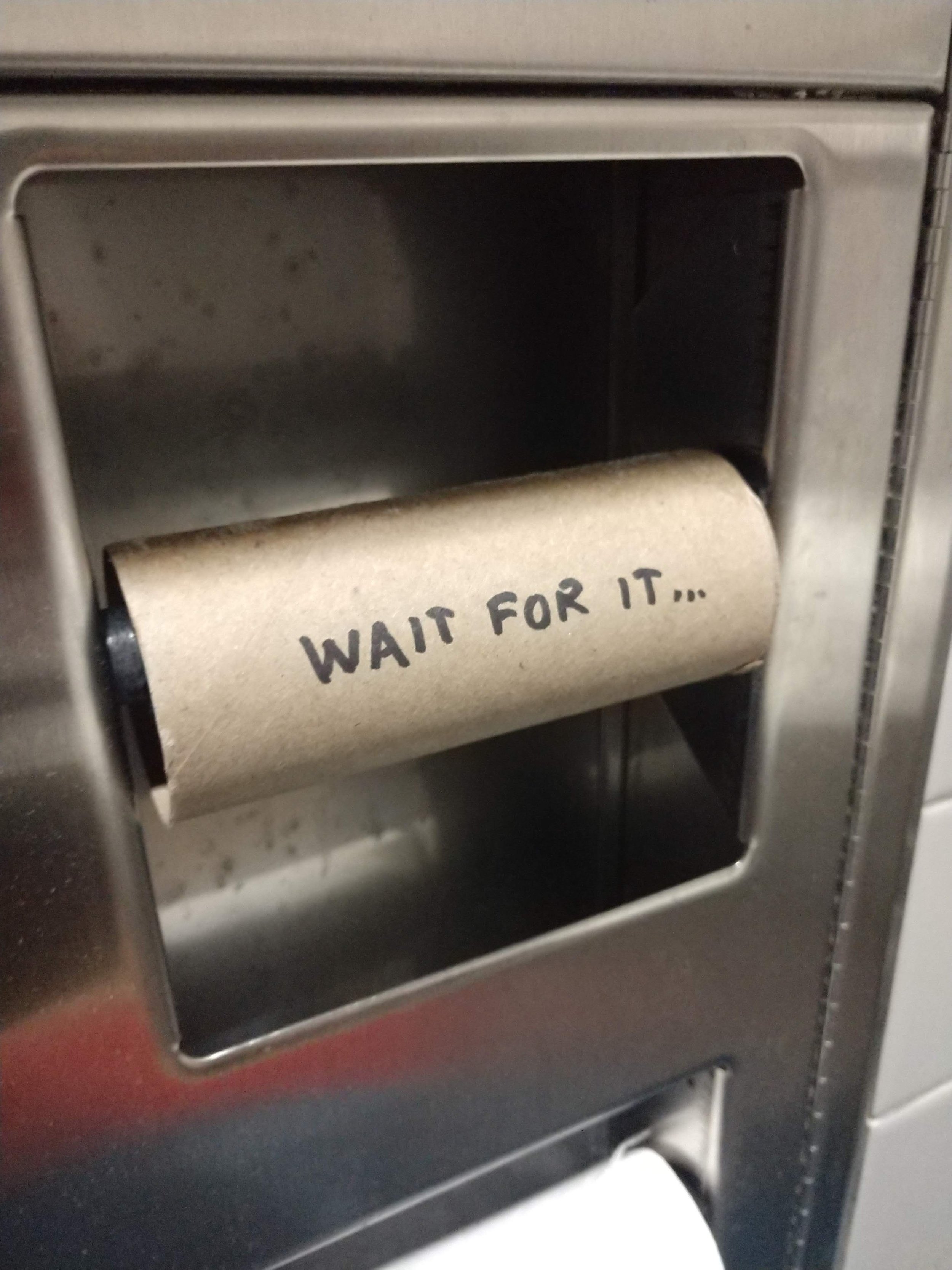
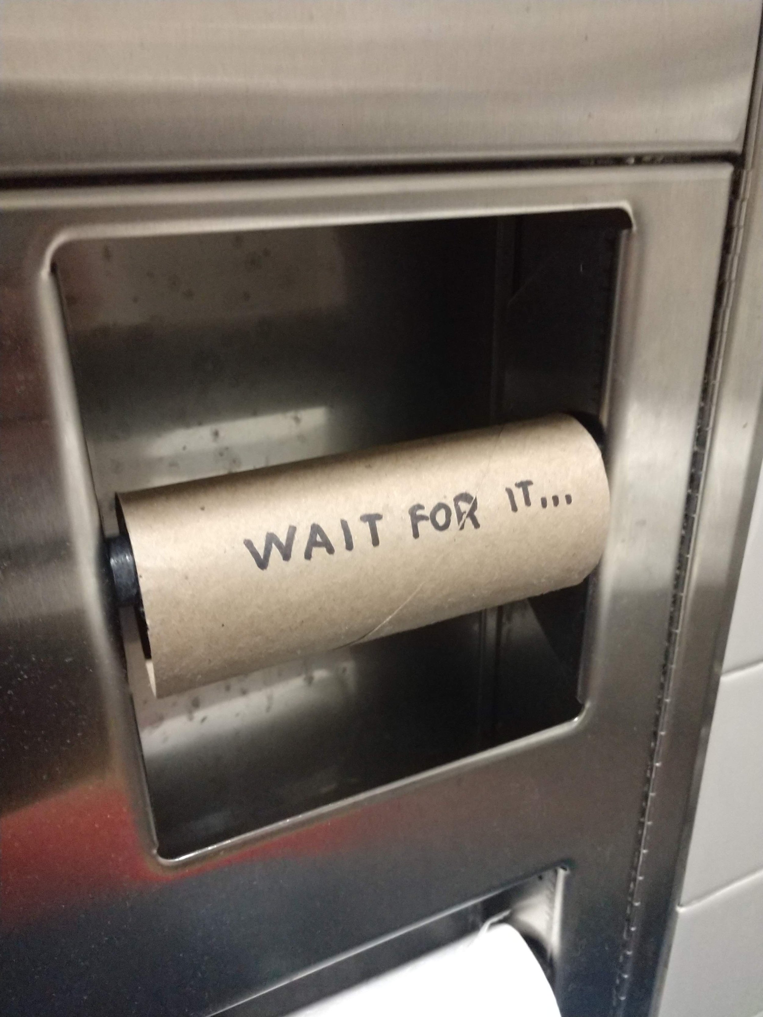
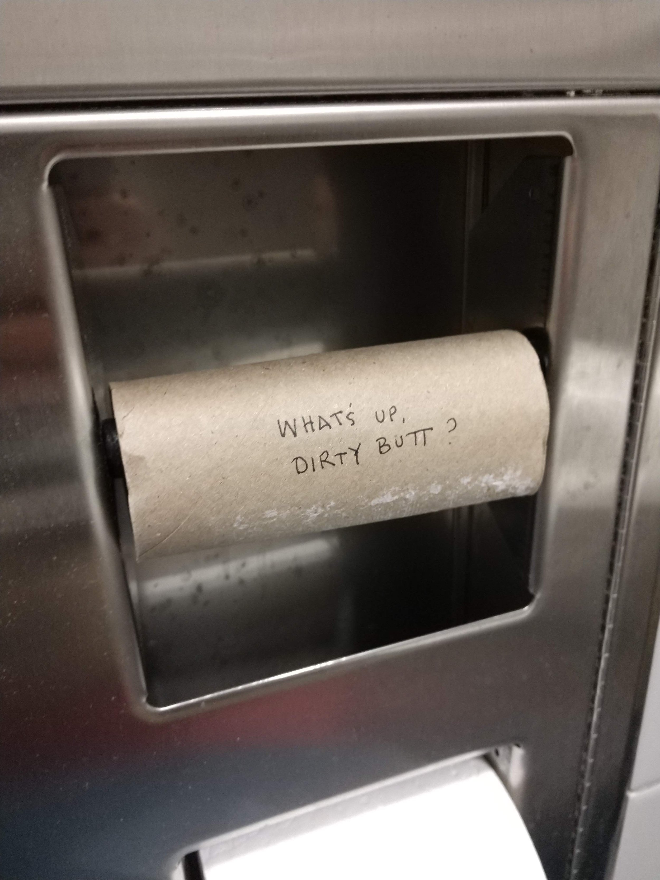
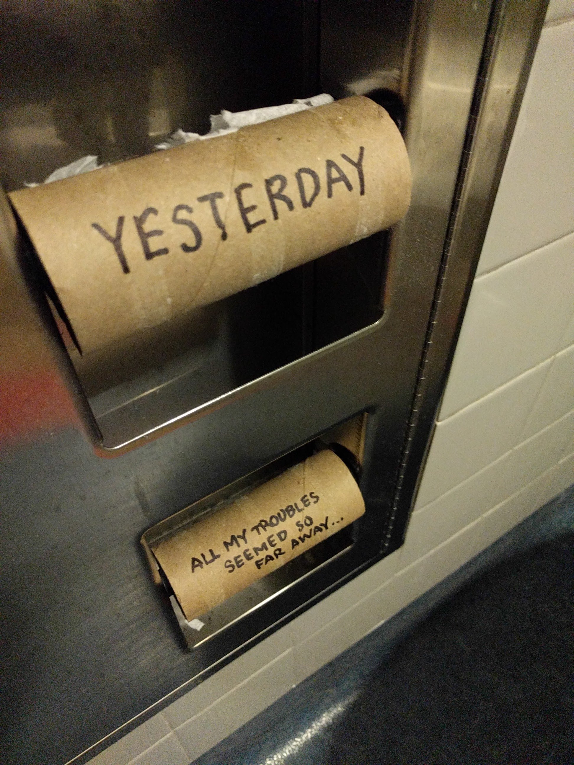
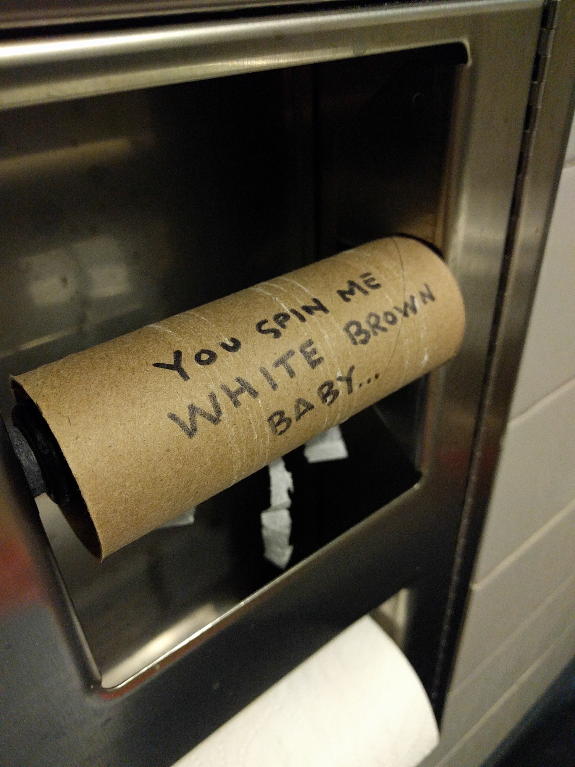
The Toilet Papers
The Toilet Papers
For nearly a decade I worked for a charitable organization in the skateboarding industry. Our office was shared with other enterprises in the skateboarding space. The building was filled with skateboarders, mostly young men, and their friends who were mostly skateboarders (and also young men).
One outcome of having a building full of skateboarding dudes was that the toilet paper rarely got replaced when it ran out. This was all the invitation for creative mischief that I needed.